
Color is the keystone of all garments. If you have found coordinating colors taxing, as most people do, you may have a wardrobe filled with neutral hues. Fortunately, a closet devoid of color can be avoided, and color harmony can be achieved once your C Color Spectrum® has been authenticated sanctioned by DNA, and the color matching technology of the C Color® App is embraced.
A C Color Spectrum is a category of a myriad of colors classified by temperature, saturation, and the predominant base of a primary color of either Blue, Yellow, or Red.
C Color Teaches You To Look Inside For Color
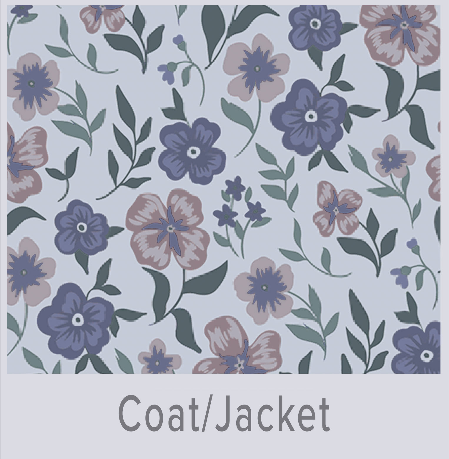
Below are examples of how individuals from each of the four C Color Spectrums can wear green, purple, red, and ochre colors in the four C Color Spectrums.
Please note that clothing and accessory colors are for reference only and do not represent the models’ C Color Spectrums.
NOTE: THIS COMPOSITE IS BEING UPDATED FOR COLOR ACCURACY
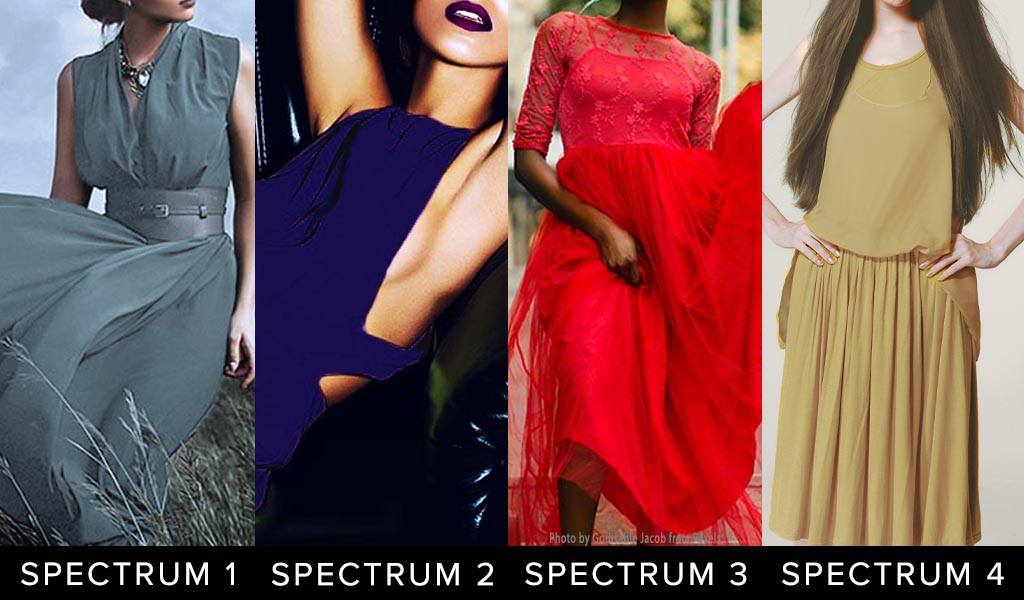 UTILIZE THE C COLOR APP TO CONFIRM YOUR C COLOR SPECTRUM COLORS
Notice the differences in the four C Color Spectrums:
- C Color Spectrum 1 Green is Cool Blue Based, Less Saturated, Appears Rubbed with Ash
- C Color Spectrum 2 Purple is Cool Blue Based, More Saturated
- C Color Spectrum 3 Red is Warm Yellow Based, Moderately Saturated
- C Color Spectrum 4 Ochre is Warm Red Based, Less Saturated, Appears Rubbed with Earth
The key to the classification of all colors is the temperature, saturation, and predominant base of one of the primary colors of blue, yellow, or red.
To oblige you in a basic understanding of color, we review the six color principles in this Blog Post.
Understanding Color Theory Fundamentals
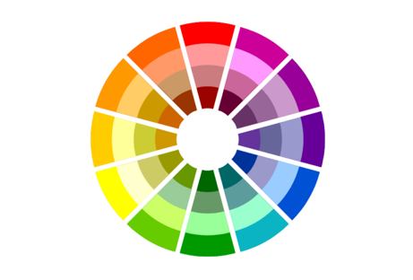
Millions of colors exist. Sixteen million and seven hundred, to be exact. The color wheel provides a simplified model of the primary color groupings and serves as the foundation for many color principles appropriated by various industries. The color wheel is a visual representation of where colors are situated in relation to the primary colors of red, yellow, or blue.
Color Wheel Consisting Of Primary Colors, Secondary Colors, Tertiary Colors
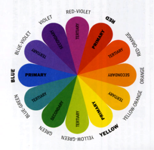
Three Core Color Properties
- Hue: Color Family
- Saturation: Intensity, Absorption
- Brightness: Lightness, Darkness
Color Wheel Below Illustrates Hue, Saturation, Value
6 Color Scheme Types
A color wheel can offer guidance in establishing harmonious color combinations; however, not all people find the colors in the color wheel appealing, so these combinations will only befit certain individuals.
C Color has categorized millions of colors into four distinct C Color Spectrums. Each color in a C Color Spectrum shares a temperature, saturation, and base color. The base color is a predominant primary color that is either blue, yellow, or red.
Obviously, the colors on the color wheels can be more or less saturated, and that changes the predominant base of the colors on the color wheels.
1. Monochromatic Color Palette
Monochromatic colors are all of the colors of a single hue, although the colors differ in saturation. Derived from a single base color, the color is more or less saturated by tints, shades, and tones. Adding the color white creates tints, and adding darker colors, such as gray or black, creates shades and tones.
Attire can be curated from various intensities of blue, such as light blue, medium blue, and dark blue, resulting in monochromatic color-coordinated apparel. The differing saturations apply to all colors. Monochromatic clothing is often seen on the covers of fashion magazines.
2. Analogous Color Palette
Analogous colors are groups of three colors that are next to each other on the color wheel and include a tertiary color. Analogous colors are comparable in certain aspects. Red, red/orange, orange, yellow, yellow/green, green, blue, blue/violet, violet, red/violet, and red are examples of analogous colors.
An analogous color-coordinated ensemble appears complementary and well-matched.
3. Complementary Color Palette
Complementary colors are pairs of colors that contrast with each other more than any other color and, when situated next to each other, appear brighter. Complementary color pairs are red/green, yellow/violet, and blue/orange. Accordingly, complementary colors or opposite colors are pairs of colors that, when combined or mixed, lose their color and appear as a grayscale color nearing white or black.
4. Triadic Color Palette
Triadic colors are comprised of three colors, evenly spaced on the color wheel, such as red, yellow, and blue. Customarily, one color will be considered the dominant color, while the two other hues are accent colors. Two triadic palettes are the primary colors of red, yellow, and blue and the secondary colors of green, purple, and orange.
To create a triadic color ensemble, select three colors that are equidistant around the color wheel, and if possible, choose patterns of these colors to avoid a color-blocked appearance.
5. Split Complementary Palette
Split Complementary colors consist of three colors: one primary color and two colors adjacent to its complement. The complement of blue/green is red/orange, and the split complement of blue/green is red and orange. Other examples include: red, blue/green and yellow/green; blue, red/orange and yellow/orange; yellow, blue/purple and red/purple. A split complementary color scheme is a variation of a complementary color scheme.
The Indicators Below Are An Example Of A Split Complementary Palette
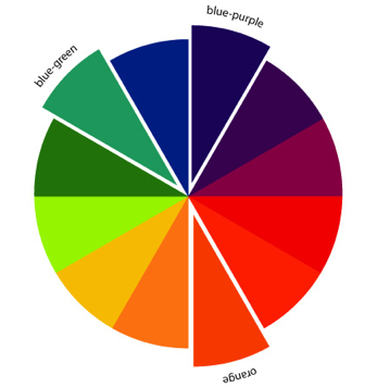
Creating Split Complementary color apparel would require blending a multitude of colors. Integrating patterns of these colors rather than solely utilizing solid colors is less complicated to achieve.
6. Tetradic Color Palette
Tetradic colors are a combination of four colors that consist of two sets of complementary colors. These colors form a rectangle on the color wheel. The richness of color harmony allows for a myriad of variations. Red, green, blue/purple, and yellow/orange, or yellow, purple, blue/green, and red/orange, are examples of tetradic color palettes.
As stated on numerous occasions above, the most favorable method of pairing these colors in attire is to intermingle patterns of these colors.
Redefine Your Wardrobe With C Color®
The six color principles may aid you in enhancing your wardrobe; nevertheless, the principles do not pertain to all individuals and do not take into account the inherent color inclinations of individuals.
The majority of the colors on the color wheels are comprised of the colors in the C Color Spectrum 3 category. A couple of the colors are within the C Color Spectrum 2 category.
Due to the fact that the color wheels primarily consist of colors that are Warm Yellow Based, and that only a couple are Cool Blue Based, the individuals that belong to C Color Spectrum 1: Cool Blue Ash Based, C Color Spectrum 2: Cool Blue Based, and C Color Spectrum 4: Warm Red Earth Based are either not well represented or not represented at all.
There is also confusion regarding the temperatures, saturations, and predominant bases of colors. Common belief is that blues, greens, and purples are cool colors and reds, yellows, and oranges are warm colors, nevertheless all colors can be cool or warm.
C Color is an Amazon Influencer. The products offered in the C Color Blog Post are certified to be within C Color Spectrum 3.
C COLOR CURATED PRODUCTS
Coordinated And Interchangeable Products In C Color Spectrum 3

If products are unavailable, Amazon will suggest substitute products. The C Color App will verify if these products are within your C Color Spectrum.
As an Amazon Influencer, C Color earns from qualifying purchases.

The C Color Ideology is predicated on a color gene within your DNA. You were born with innate color predispositions.
C Color is the first and only company to quantify intuitive color preferences. Quantifying intuitive color intelligence is the specialty of our lifestyle technology company.
The C Color Ideology and Methodology will support you in living your life in your optimal color environment.
C Color® has an online store to further direct you in your endeavor with colors.
C COLOR COORDINATES
Interchangeable Colors And Patterns In Your C Color Spectrum Developed As Examples For Fashion And Décor
 Shop C Color Spectrum 1
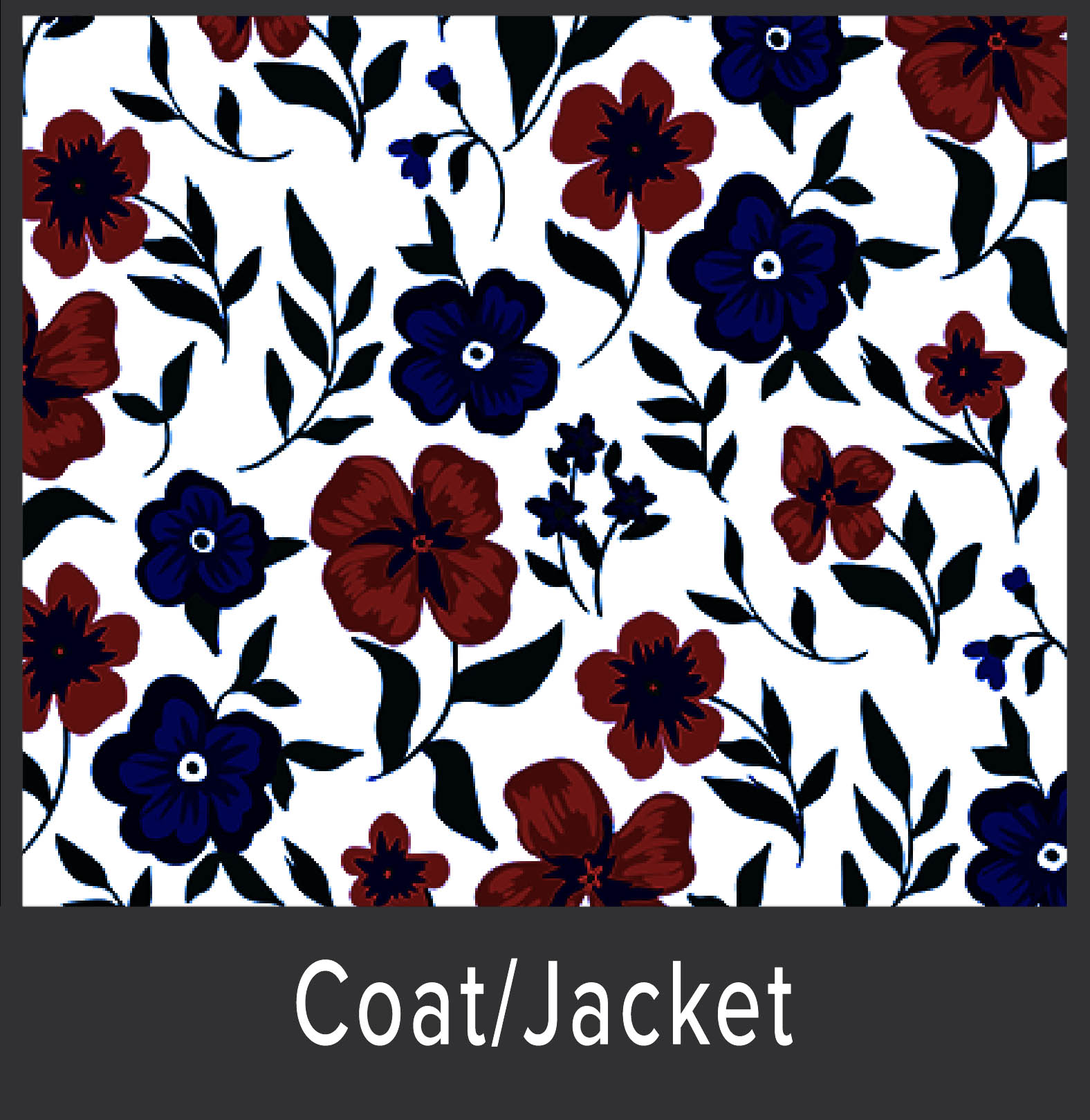 Shop C Color Spectrum 2
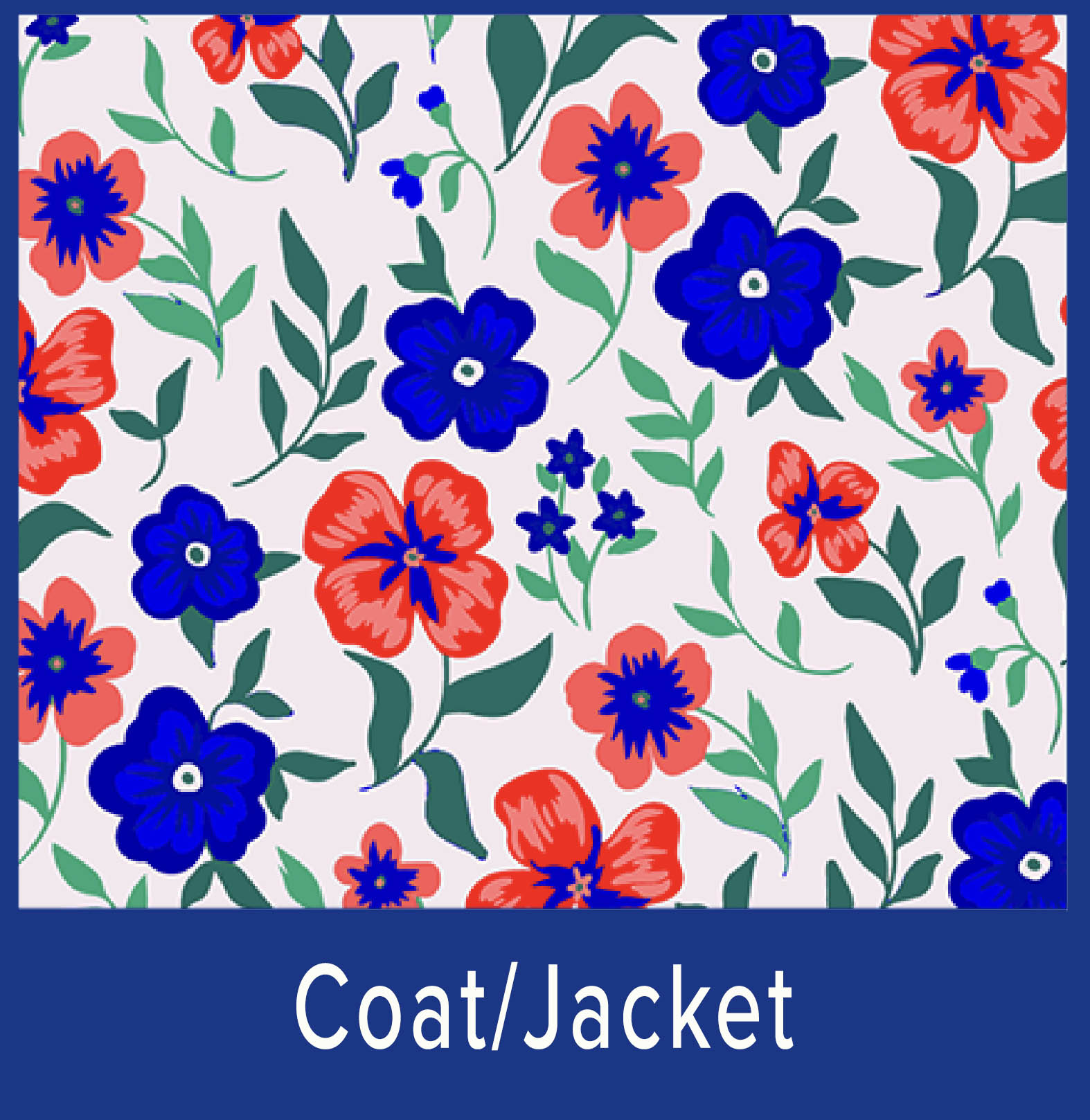 Shop C Color Spectrum 3
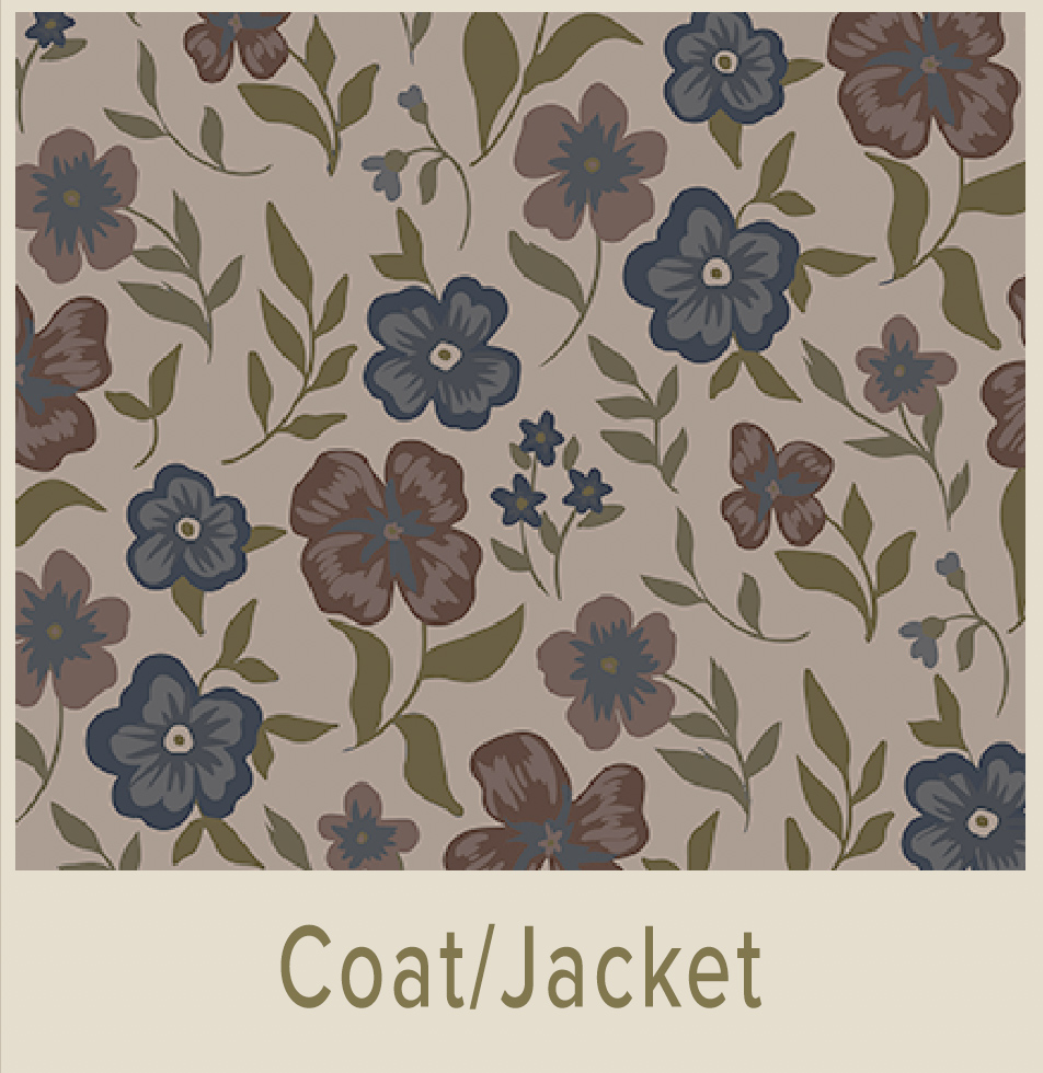 Shop C Color Spectrum 4
Prerequisite: C Color Quiz
Palettes are supplemental to the C Color App
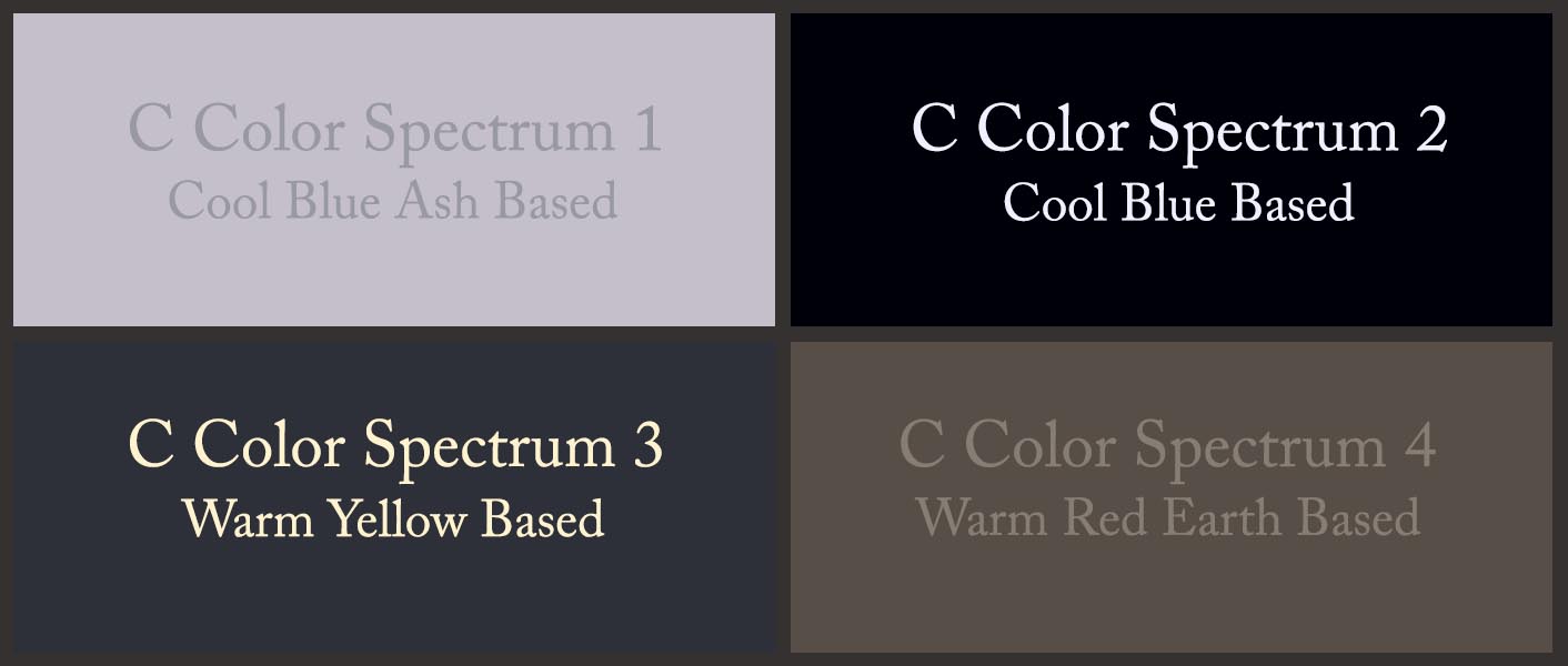
The above color quadrant displays a Cool Blue Ash Based gray color, a Cool Blue Based black color, a Warm Yellow Based gunmetal color, and a Warm Red Earth Based light taupe color, as examples to further distinguish the four C Color Spectrums. Each C Color Spectrum® contains millions of every color.
The C Color® Quiz determines your natural desire for color and your C Color Spectrum. The C Color App will identify the colors within your C Color Spectrum.
To begin the process, take the 5-minute C Color Quiz. The objective of the C Color Quiz is to select the color quadrant that immediately catches your eye. In doing so, you are following your intrinsic color proclivities. Thinking about your color selections will skew your results, as the accurate results emanate from intuitive choices, not thought choices.
Due to this reason, receiving a Personal C Color Analysis differs from all others on the market.
The efficacy of the C Color Quiz is 99.8%. We do not guarantee hundred percent efficacy, as clients may not consistently follow their innate preferences or intuition throughout the C Color Quiz.
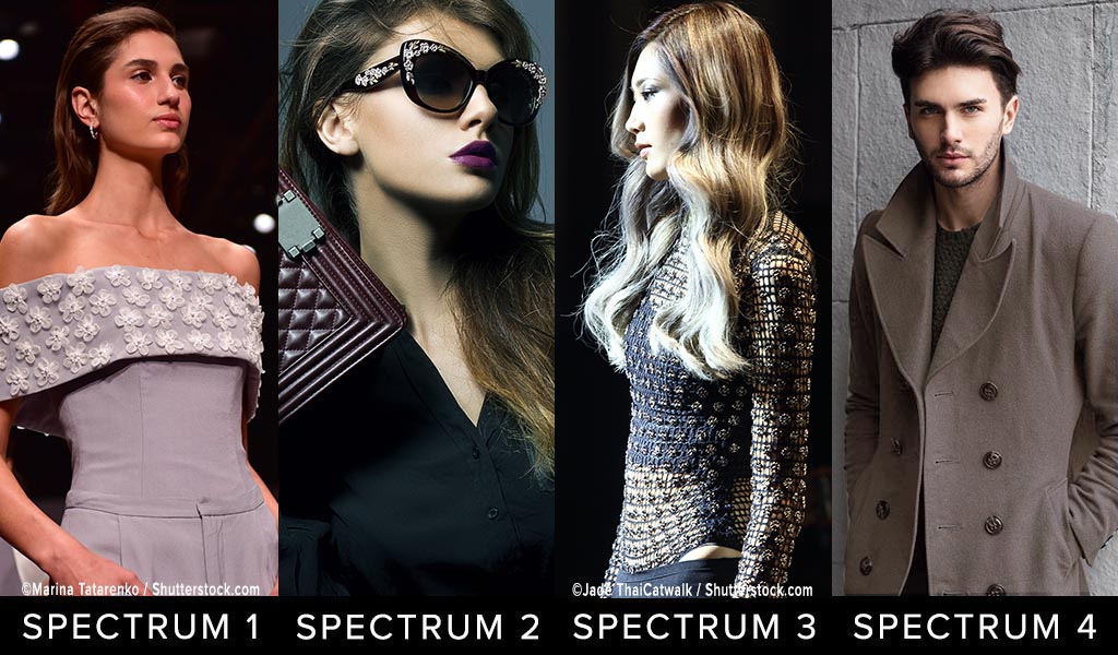
Below are examples of how individuals from each of the four C Color Spectrums can wear heather, charcoal, gray and taupe colors.
Please note that clothing and accessory colors are for reference only and do not represent the models’ C Color Spectrums.
NOTE: THIS COMPOSITE IS BEING UPDATED FOR COLOR ACCURACY
 UTILIZE THE C COLOR APP TO CONFIRM YOUR C COLOR SPECTRUM COLORS
Notice the differences in the four C Color Spectrums:
- C Color Spectrum 1 Heather is Cool Blue Based, Less Saturated, Appears Rubbed with Ash
- C Color Spectrum 2 Charcoal is Cool Blue Based, More Saturated
- C Color Spectrum 3 Gray is Warm Yellow Based, Moderately Saturated
- C Color Spectrum 4 Taupe is Warm Red Based, Less Saturated, Appears Rubbed with Earth
The key to the classification of all colors is the temperature, saturation, and predominant base of one of the primary colors of blue, yellow, or red.
Engage the C Color® App as your personal Color Consultant that is at your fingertips on your mobile device.
- All colors contain numerous colors; consequently, it is imperative, while shopping in stores or online, to photograph the item that you are considering at a distance and to color correct the photograph with the Lighting and Filters features.
- The photographed color must match the color of the actual item that the eyes see.
- Once the above two steps are completed, choose a zoomed-in section of the pure color, even if blurred, to match, and the C Color App will reveal whether or not the color is within your C Color Spectrum.
- The built-in capability of the Smartphone to lighten or darken the photograph can be used if necessary.
- Avoid bright areas and shadowed areas, as those conditions can affect the color match.
Avail yourself of the C Color App to photograph clothing, accessories, cosmetics, home, office, automobile, interiors/exteriors, and all else in your world.
The zooming capacity of the C Color Matching Technology has been enhanced to allow for greater accuracy. This improvement ensures that the purest color of the article to be matched can be identified more proficiently and opportunely.
The C Color App has been upgraded to include a color matching Instructional Video, C Color Courses, C Color E-Books and C Color Spectrum Virtual Color Galleries.
C Color Spectrum Virtual Color Galleries within the C Color App were developed as a vantage point for you from which to better understand the colors within your C Color Spectrum.
The C Color App is a comprehensive color palette that identifies the limitless number of colors that are available to you. These colors are all from within your C Color Spectrum. Appropriately, the C Color Spectrum Virtual Color Galleries are supplemental to the C Color App.
Please be sure to visit the C Color Website.
The refreshed C Color Website includes a plethora of engaging content, simple navigability, and instructive visuals representative of each C Color Spectrum.
Browse the C Color Website and C Color Blog Posts for a colorful experience and inspiration regarding all things color.
With C Color, you can ascertain your laudable colors and fill your closet with items that allow you to Look, Think, Feel, Act, Learn, and Heal Your Best.
The C Color® App, as the 21st Century Palette and Color Consultant is the expert Eye, that is accurate, meets your color needs, answers your color questions, assists you in color decision making and saves you thousands of dollars by eliminating misguided color choices.
C Color conquers the color conundrum and teaches you to employ color to successfully express yourself!
Look and feel prettier or more handsome; experience glowing skin; receive compliments; gain confidence; and garner color confidence.
C Color Gets You There!
Remember: Hair, Eye, and Skin Colors Don’t Matter
Download The C Color App And Take The C Color Quiz