
To mark the beginning of 2022, Pantone has announced the newest Color of the Year, “Very Peri”.
Pantone selects a new color to be showcased for the entirety of the year, ordinarily representing a sentiment of what the upcoming period of time holds.
This year’s “Very Peri” is described by Pantone as a bold periwinkle. Pantone claims that “Very Peri” elicits and urges feelings of ingenuity and curiosity and allows for new perspectives of hope and possibility.
“Gaming” and the influx of attention toward an increasingly digital world have played a major role in the declaration of “Very Peri” as the 2022 Color of the Year.
The History Of Pantone
Since 1999, when the Color of the Year Program was established, Pantone has selected preexisting colors from its database. For the first time in Color of the Year history, Pantone has specially crafted a color to showcase the transformations that dominated our lives in 2021.
The process of selecting the Color of the Year takes place in Europe, where Pantone hosts international representatives of the color industry to vote upon potential colors.
Pantone, defined as “all colors,” originated as a printing company specializing in color.
In the 60’s, Pantone designed the Pantone Matching System (PMS), allowing color to be consistent in terms of how it appeared on paper after being printed. The matching system uses color swatches, which have an identifying code, in order to yield exact colors. These identifying codes are accompanied by a letter, U, C, or M, representative of the nature of each color’s property: Uncoated, Coated, and Matte, respectively.
The PMS allows printers, designers, and other businesses and consumers to display coloring, both physically and digitally, that accurately aligns with their brand or individual identity. The PMS is still relevant today, with over 9,000 identified Pantone colors.
Pantone And Dictating Trends
Many look to Pantone’s establishment of a yearly color to dictate upcoming trends in beauty, fashion, graphic design, interior design, and other industries heavily relying on color.
Pantone has used this as an opportunity to market its own Color of the Year products, opening doors to collaboration with 3rd party companies.
In 2012, Pantone introduced a collaboration with Sephora with its Color of the Year, “Tangerine Tango”, as the guiding force for a new collection of beauty products. Cariuma has designed a line of sneakers in collaboration with Pantone, highlighting this year’s “Very Peri”.
While following trends or indulging in popular colors influenced by large brands, society, or one’s inner circle may be comfortable, they are subjective and do not account for the intrinsic DNA color propensities of individuals.
C Color Teaches You To Look Inside For Color

C Color® makes color personal with a Personal Color Analysis App that takes into account the inherent color inclinations of individuals and allows subscribers to discover their own optimal colors with the C Color® Quiz and color matching technology system.
Via the C Color® App, you can become your own color analyst and be color independent.
How Can I Distinguish My Optimal Colors?
Confusion pertaining to color is an unfortunate circumstance that many individuals struggle with daily; even though, the strife is unnecessary.
The C Color® Ideology is predicated upon a color gene within your DNA. You are born with instinctive predilections toward colors; consequently, you embody the virtue of color intelligence.
There are 16.7 million colors in the world, and C Color® offers an innovative Methodology to navigate color and direct you in choosing the incomparable colors for your wardrobe, home, office, automobile interiors/exteriors, and everything else in your world.
C Color®, as the first company to quantify intuitive color partialities, appropriates the highly accurate C Color® Quiz Assessment, available on the mobile application, to classify users within one of the four C Color Spectrums.
A C Color Spectrum is a category of millions of colors classified by temperature, saturation, and the predominant base of a primary color of either Blue, Yellow, or Red.
Knowing and embodying your exemplary colors can be life changing and, when implemented, can lead to an increase in self-confidence, the creation of inspiring environments, amelioration of the mind, and an overall satisfaction with daily judgments regarding color.
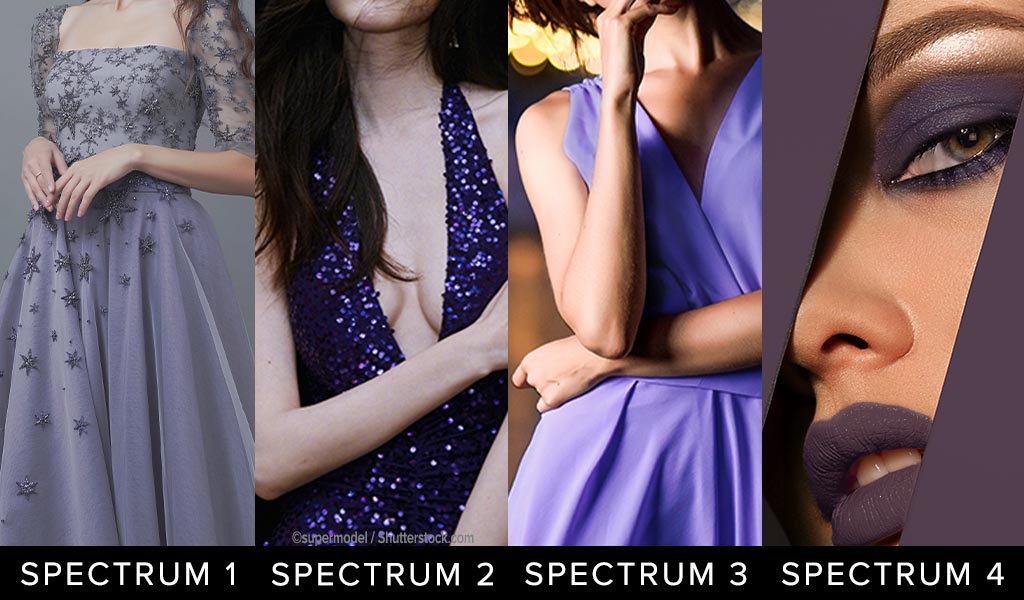
Below is an example of a model in both C Color Spectrum 1, which is predominantly Cool Blue Ash Based, and C Color Spectrum 3, which is predominantly Warm Yellow Based.
Distinctively, when the model is clad in C Color Spectrum 3 colors, she has a flawless and glowing complexion, as the model, in reality, is within the C Color Spectrum 3 category.
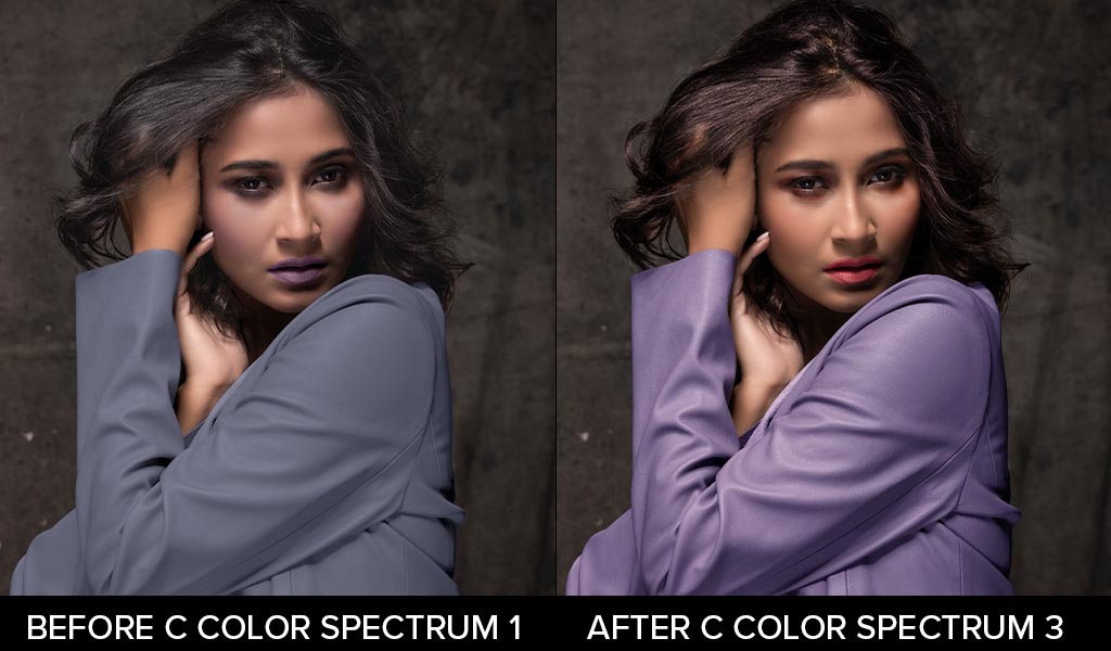 The After Photograph Displays Yellow Based Hair, Makeup, and Jacket, Resulting In C Color Spectrum 3
The key to the classification of all colors is the temperature: cool or warm, saturation: less, more, or moderate, and predominant base of a primary color: blue, yellow, or red.
Correspondingly, to guide you in assessing the colors of “Very Peri”, C Color also offers an Online Store that sells C Color Coordinates.
C COLOR COORDINATES
Interchangeable Colors And Patterns In Your C Color Spectrum Developed As Examples For Fashion And Décor
 C Color Spectrum 1
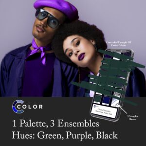 C Color Spectrum 2
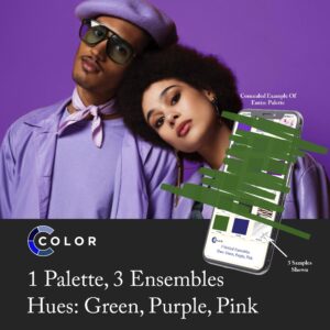 C Color Spectrum 3
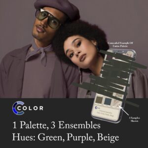 C Color Spectrum 4
Prerequisite: C Color Quiz
Palettes are supplemental to the C Color App
Becoming your own color consultant is the epitome of freedom. When searching for an app to find your colours, consider the C Color® App.
Color theory for dressing and all else depends on a color gene within your DNA, and the best color analysis app is the app that addresses that truth.
The external features of hair colors, eye colors, and complexion colors are not relevant in determining your C Color Spectrum® or your superlative colors in general; accordingly, C Color® does not employ that ineffective protocol.

To determine your C Color Spectrum®, take the five-minute C Color Quiz. The objective of the C Color Quiz is to select the color quadrant that immediately catches your eye. In doing so, you are following your immanent color predispositions. Thinking about the color options will skew the aftereffects.
The accurate results of the C Color Quiz are based on intuitive selections, not thought choices.
Due to this reason, receiving a Personal C Color Analysis differs from all others on the market. Accordingly, there is no need for a color draping app.
The efficacy of the C Color Quiz is 99.8%. We do not guarantee hundred percent efficacy, as clients may not consistently follow their innate preferences or intuition throughout the C Color Quiz.
Ensuing the authentication of your C Color Spectrum®, take advantage of the C Color® App and photograph the colors of items that you are interested in to substantiate whether or not the colors are within your C Color Spectrum®.
The C Color® database has the capability to differentiate millions of colors. The peace of mind that emanates when you choose the proper colors to surround yourself with and wear is priceless.
C Color® conquers the color conundrum and teaches you to exploit color to successfully express your genuine essence!
Look and feel prettier or more handsome; experience glowing skin; receive compliments; gain confidence; and garner color confidence.
C Color Gets You There!
Remember: Hair, Eye, and Skin Colors Don’t Matter
How Can I Incorporate “Very Peri” Into My Life?
Examples of the ways in which ”Very Peri” can be incorporated in the clothing, accessory, and makeup arenas and in your environment through furnishings, lighting, and paint are as follows.
Given that “Very Peri” is an original Pantone color developed for the “Color of the Year” occasion, it is impossible to find the precise color unless it is a patented “Very Peri” Pantone product or from an official “Very Peri” collaboration. The examples shown act as a guide in pinpointing a color resembling ”Very Peri”, such as periwinkle.
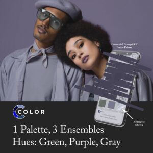
Below is the first example of how individuals from each of the four C Color Spectrums can wear alternatives to “Very Peri” purple colors.
Please note that clothing and accessory colors are for reference only and do not represent the models’ C Color Spectrums.
 UTILIZE THE C COLOR APP TO CONFIRM YOUR C COLOR SPECTRUM COLORS
Notice the differences in the four C Color Spectrums:
- C Color Spectrum 1 Purple is Cool Blue Based, Less Saturated, Appears Rubbed with Ash
- C Color Spectrum 2 Purple is Cool Blue Based, More Saturated
- C Color Spectrum 3 Purple is Warm Yellow Based, Moderately Saturated
- C Color Spectrum 4 Purple is Warm Red Based, Less Saturated, Appears Rubbed with Earth
The key to the classification of all colors is the temperature, saturation, and predominant base of one of the primary colors of blue, yellow, or red.
By investing in your C Color Spectrum for all of the aspects of your life, you can Look, Think, Feel, Act, Learn, and Heal Your Best.
How C Color Classifies “Very Peri” Into A C Color Spectrum®
Subsequent to taking the C Color Quiz, you may be wondering if ”Very Peri” is a praiseworthy color for you.
Pantone’s “Very Peri” has been identified as a C Color Spectrum 3, given the predominant Warm Yellow Base and Moderate Saturation.
If you have discovered through the C Color Quiz that you are not within the C Color Spectrum 3 category and “Very Peri” is not a suitable color for you, do not fret. There are millions of purples that are appropriate for all individuals from all of the C Color Spectrums, with the distinguishing factor of each purple hue being the temperature, saturation, and predominant base of a primary color.
Colors similar to “Very Peri” that are suitable for C Color Spectrum 1 individuals are predominantly Cool Blue Ash Based Purples. The colors will have less saturation and appear rubbed with ash.
Colors similar to “Very Peri” that are suitable for C Color Spectrum 2 individuals are predominantly Cool Blue Based Purples. The colors will have more saturation.
Colors similar to “Very Peri” that are suitable for C Color Spectrum 4 individuals are predominantly Warm Red Earth Based Purples. The colors will have less saturation and appear rubbed with earth.
People often confuse the temperatures, saturations, and predominant bases of colors. Color analysts, makeup artists, stylists, designers, and most other industry professionals categorize blues, greens, and purples as cool colors and reds, yellows, and oranges as warm colors; nevertheless, all colors can be cool or warm.
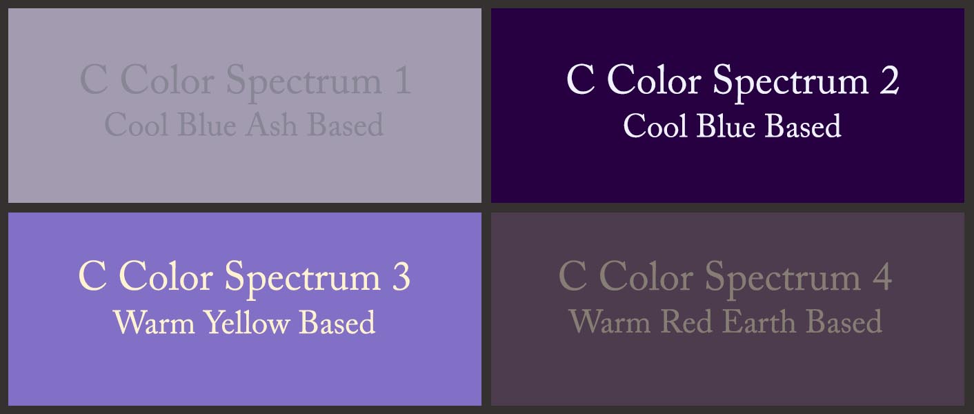
The above color quadrant displays a Cool Blue Ash Based purple color, a Cool Blue Based purple color, a Warm Yellow Based violet color, and a Warm Red Earth Based purple color, as examples to further distinguish the four C Color Spectrums. Each C Color Spectrum® contains millions of every color.
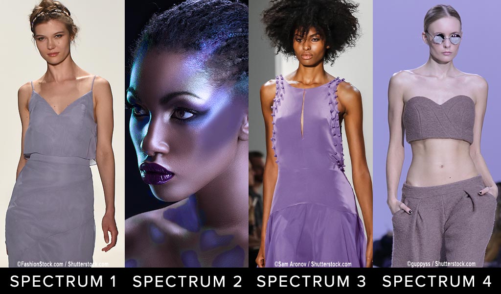
Below is the second example of how individuals from each of the four C Color Spectrums can wear “Very Peri” purple colors.
Please note that clothing and accessory colors are for reference only and do not represent the models’ C Color Spectrums.
NOTE: THIS COMPOSITE IS BEING UPDATED FOR COLOR ACCURACY
 UTILIZE THE C COLOR APP TO CONFIRM YOUR C COLOR SPECTRUM COLORS
Notice the differences in the four C Color Spectrums:
- C Color Spectrum 1 Purple is Cool Blue Based, Less Saturated, Appears Rubbed with Ash
- C Color Spectrum 2 Purple is Cool Blue Based, More Saturated
- C Color Spectrum 3 Purple is Warm Yellow Based, Moderately Saturated
- C Color Spectrum 4 Purple is Warm Red Based, Less Saturated, Appears Rubbed with Earth
The key to the classification of all colors is the temperature, saturation, and predominant base of one of the primary colors of blue, yellow, or red.
Once your C Color Spectrum is verified, avail yourself of the C Color App to ascertain whether or not all goods are within your C Color Spectrum.
- Considering that all colors contain numerous colors, it is imperative to photograph the object of interest at a distance and to color correct the photograph with the Lighting and Filters features.
- The photographed color must match the color of the actual item that the eyes see.
- Once the above two steps are completed, choose a zoomed in section of the pure color, even if blurred to match, and the C Color App will reveal whether or not the color is commendable for you.
- The zooming capacity of the C Color Matching Technology has been enhanced to allow for greater accuracy. This improvement ensures that the purest color of the article to be matched can be identified more proficiently and opportunely.
- Apply the built-in capability of the Smartphone to lighten or darken the photograph, if necessary.
- Avoid bright areas and shadowed areas, as those conditions can affect the color match.
The C Color App has been upgraded to include a color matching Instructional Video, C Color Courses, C Color E-Books, and C Color Spectrum Virtual Color Galleries.
C Color Spectrum Virtual Color Galleries within the C Color App were developed as a vantage point for you from which to better understand the colors within your C Color Spectrum.
The C Color® App is a comprehensive color palette that identifies the limitless number of colors that are available to you. These colors are all from within your C Color Spectrum. Appropriately, the C Color Spectrum Virtual Color Galleries are supplemental to the C Color App.
Please be sure to visit the C Color Website.
The refreshed C Color Website includes a plethora of engaging content, simple navigability, and instructive visuals representative of each C Color Spectrum.
Below are examples of “Very Peri” interior colors for each of the three C Color Spectrums and an exterior color for one C Color Spectrum.
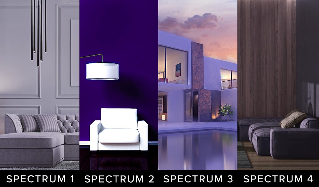 UTILIZE THE C COLOR APP TO CONFIRM YOUR C COLOR SPECTRUM COLORS
Notice the differences in the four C Color Spectrums:
- C Color Spectrum 1 Purple is Cool Blue Based, Less Saturated, Appears Rubbed with Ash
- C Color Spectrum 2 Purple is Cool Blue Based, More Saturated
- C Color Spectrum 3 Purple is Warm Yellow Based, Moderately Saturated
- C Color Spectrum 4 Purple is Warm Red Based, Less Saturated, Appears Rubbed with Earth
The key to the classification of all colors is the temperature, saturation, and predominant base of one of the primary colors of blue, yellow, or red.
Browse the C Color Website and C Color Blog Posts for a colorful experience and inspiration regarding all things color.
C Color is an Amazon Influencer. The products offered in the C Color Blog Post are certified to be within C Color Spectrum 3.
C COLOR CURATED PRODUCTS
Coordinated And Interchangeable Products In C Color Spectrum 3

If products are unavailable, Amazon will suggest substitute products. The C Color App will verify if these products are within your C Color Spectrum.
As an Amazon Influencer, C Color earns from qualifying purchases.
Your True Color Proclivities Are Within Reach
The favorable news, also mentioned in all C Color® Blog Posts relating to Pantone colors, is that in general, all individuals from all C Color Spectrums® can wear renditions of each Pantone Color of the Year, with the exceptions being the 2019, 2024, and 2025 colors.
As per the previous Pantone colors, in 2017 “Greenery” and in 2018 “Ultra Violet” were within the C Color Spectrum 3 category, although individuals from all C Color Spectrums wear variations of green and violet or lavender.
The key is that the colors will have the properties of each specific C Color Spectrum.
The Pantone colors, in 2019 “Living Coral” and in 2024 “Peach Fuzz” were within the C Color Spectrum 3 category, although variations of ”Living Coral” and “Peach Fuzz” could only be utilized by C Color Spectrum 4 individuals.
Peach, Coral, and Orange colors do not appeal to individuals within the C Color Spectrum 1 category, which is Cool, Blue Ash Based, and Less Saturated, and individuals within the C Color Spectrum 2 category, which is Cool, Blue Based, and More Saturated.
The 2020 Pantone Color of the Year was “Classic Blue,” and that particular hue is within the C Color Spectrum 4 category, although individuals from all C Color Spectrums wear variations of light blue.
In 2021, Pantone chose two Colors of the Year, and they were ”Ultimate Gray,” which was within the C Color Spectrum 1 category, and “Illuminating Yellow”, which was within the C Color Spectrum 3 category, although individuals from all C Color Spectrums wear variations of gray and yellow.
The 2023 color “Viva Magenta” was within the C Color Spectrum 3 category, although individuals from all C Color Spectrums wear variations of raspberry or burgundy.
The 2025 Pantone swatch of “Mocha Mousse” is a tan color that has a predominant Warm, Red Earth Base, and is Less Saturated, and those color properties are within the C Color Spectrum 4 category. With that said, variations of the tan colors can only be utilized by C Color Spectrum 3 individuals.
Given that “Mocha Mousse” is an original Pantone color developed for the “Color of the Year” occasion, it is impossible to find the precise color. The Pantone website does display various iterations of “Mocha Mousse”.
If you have discovered through the C Color Quiz that you are within the C Color Spectrum 3 category and the actual swatch of “Mocha Mousse” is not a suitable color for you, do not worry. As mentioned above, there are millions of tan colors that are appropriate for C Color Spectrum 3 individuals, with the distinguishing factor of each tan hue being the temperature, saturation, and predominant base of a primary color.
Lastly, tan colors do not appeal to individuals within the C Color Spectrum 1 category, which is Cool, Blue Ash Based, and Less Saturated, and individuals within the C Color Spectrum 2 category, which is Cool, Blue Based, and More Saturated.
The above are perfect examples of the fact that color trends may or may not suit your inherent DNA color preferences. Fortuitously, there are millions of each color, and all C Color Spectrums contain endless variations of the Pantone colors.
To reiterate, if any of the Pantone Colors of the year are not favorable colors for you, the limitless color options in your C Color Spectrum® can be elected.
Wearing and utilizing colors within your C Color Spectrum® can enhance your appearance, can enable you to think more clearly, can produce feelings of well-being, can motivate you to act your best, can assist you in absorbing new concepts more readily and distinctly, and can aid you in healing.
The C Color® App, as the 21st Century Palette and Color Consultant, is accurate, meets your color needs, answers your color questions, assists you in color decision making and saves you thousands of dollars by eliminating misguided color choices.
Make Color Personal; Look, Think, Feel, Act, Learn, and Heal with C Color
Download The C Color App And Take The C Color Quiz Today