
One of the most challenging decisions concerning décor refers to the selection of paint colors. The color of your walls can either be a focal point of a room or an understatement, and shading and lighting can instantly transform the hue of your paint color, for better or for worse.
Before settling on a paint color for your residence or a room, there are a few important guidelines to observe and, of course, a myriad of other considerations.
The Challenges of Selecting Paint Colors
Finding a color that you will enjoy for years can be a confounding endeavor.
Colors appear different in cans of paint or on paint swatches than they do on the walls of your residence. You may think that you found the perfect color, only to be disappointed once you apply the paint to your walls.
For example, light colors can display darker on surfaces, and bright colors can appear darker and more intense on large surfaces. Once painted, certain colors can turn flat, while others can project movement.
Certain colors are also more difficult to assess than others. Once, when choosing a yellow paint color for a bedroom, the Founder of C Color had the room painted three different times.
On the first occasion, the yellow paint appeared as an ashy yellow color, and on the second occasion, the yellow paint glowed green from the room, similar to a neon bulb or a “Ghostbusters” scene.
On the third and final occasion, that the yellow paint was applied to the wall, white paint was added to the yellow color to dilute the hue. For all intents and purposes, the color was made custom and virtually impossible to replicate at a future date.
When selecting paint colors, be aware that superior paint appears differently in different areas of the residence, even though the paint color is identical. Shading and lighting affect color as well, making the paint color selection process even more problematic.
People also often confuse the temperatures, saturations, and predominant bases of colors. Color analysts, makeup artists, stylists, designers, and most other industry professionals categorize blues, greens, and purples as cool colors and reds, yellows, and oranges as warm colors; nevertheless, all colors can be cool or warm.
C Color® is the first and only company to quantify intuitive color preferences. Quantifying individuals’ intuitive color tendencies is the specialty of our lifestyle technology company.
C Color Teaches You To Look Inside For Color
The C Color Ideology and Methodology will allow you to live life in your consummate color environment.
The C Color Ideology is predicated upon a color gene within your DNA. You are born with intrinsic propensities toward colors. When you choose the colors from your C Color Spectrum®, you are following an immanent genetic/DNA trait.
C Color has classified the 16.7 millions of colors into four C Color Spectrums signified by the temperature: cool or warm, saturation: less, more or moderate, and predominant base of one of the primary colors of: blue, yellow, or red.

The innovative C Color® Methodology instructs you in navigating color by assisting you with choosing the unparalleled colors for your wardrobe, home, office, automobile interiors/exteriors, and everything else in your world.
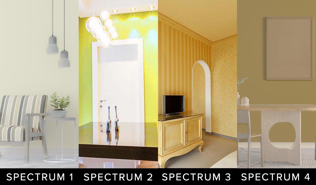
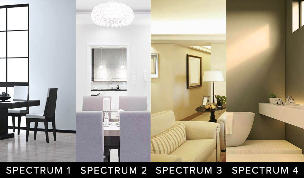
Below are examples of how each of the four C Color Spectrums can appropriate the color yellow in various areas of a home.
 UTILIZE THE C COLOR APP TO CONFIRM YOUR C COLOR SPECTRUM COLORS
Notice the differences in the four C Color Spectrums:
- C Color Spectrum 1 Yellow is Cool Blue Based, Less Saturated, Appears Rubbed with Ash
- C Color Spectrum 2 Neon Yellow is Cool Blue Based, More Saturated
- C Color Spectrum 3 Yellow is Warm Yellow Based, Moderately Saturated
- C Color Spectrum 4 Ochre is Warm Red Based, Less Saturated, Appears Rubbed with Earth
The key to the classification of all colors is the temperature, saturation, and predominant base of one of the primary colors of blue, yellow, or red.
Paint Color Tips
There are standard rules of thumb when choosing paint colors, and these rules are germane to all colors.
Choose Light Colors For Small Rooms
To increase a room size, resort to lighter colored paint and larger furniture, as that will create a feeling of spaciousness.
Select Darker Colors To Minimize The Size Of The Room
If you desire to create a cozier feel in an oversized room, employ darker or medium hues.
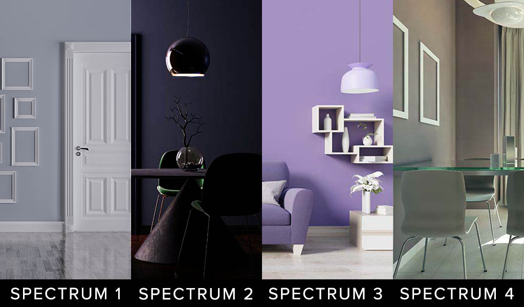
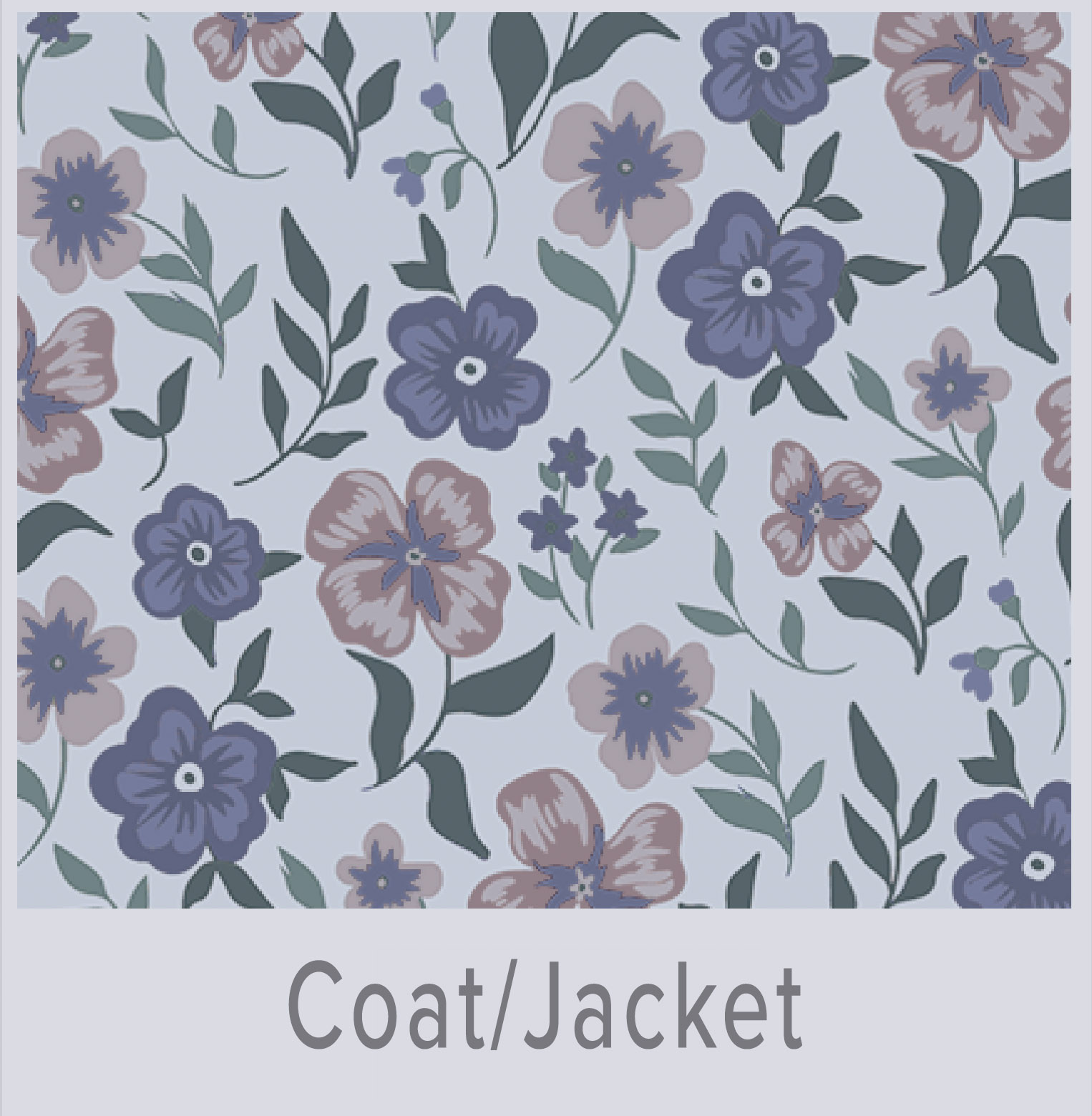
Below are examples of how each of the four C Color Spectrums can bring into play the colors of lavender, charcoal, violet, and taupe in various areas of a home.
 UTILIZE THE C COLOR APP TO CONFIRM YOUR C COLOR SPECTRUM COLORS
Notice the differences in the four C Color Spectrums:
- C Color Spectrum 1 Lavender is Cool Blue Based, Less Saturated, Appears Rubbed with Ash
- C Color Spectrum 2 Charcoal is Cool Blue Based, More Saturated
- C Color Spectrum 3 Violet is Warm Yellow Based, Moderately Saturated
- C Color Spectrum 4 Taupe is Warm Red Based, Less Saturated, Appears Rubbed with Earth
The key to the classification of all colors is the temperature, saturation, and predominant base of one of the primary colors of blue, yellow, or red.
Choose Paint Colors That You Are Inherently Drawn Toward
Test Paint Swatches In Multiple Areas Of The Room
A large, bright window or a dark crevice can change the appearance of your paint color. Apply paint samples to areas that receive different levels of lighting to ensure your satisfaction.
Select 3 To 4 Colors For Your Palette
Once you have deduced your C Color Spectrum, choose colors that you intuitively prefer rather than focusing on trends. Decide on 3 to 4 foundational colors for your home interior palette, as once those bedrock colors are ascertained, you can expand to other colors from that vantage point.
Whether you understand the groundwork of your C Color Spectrum or not is irrelevant.
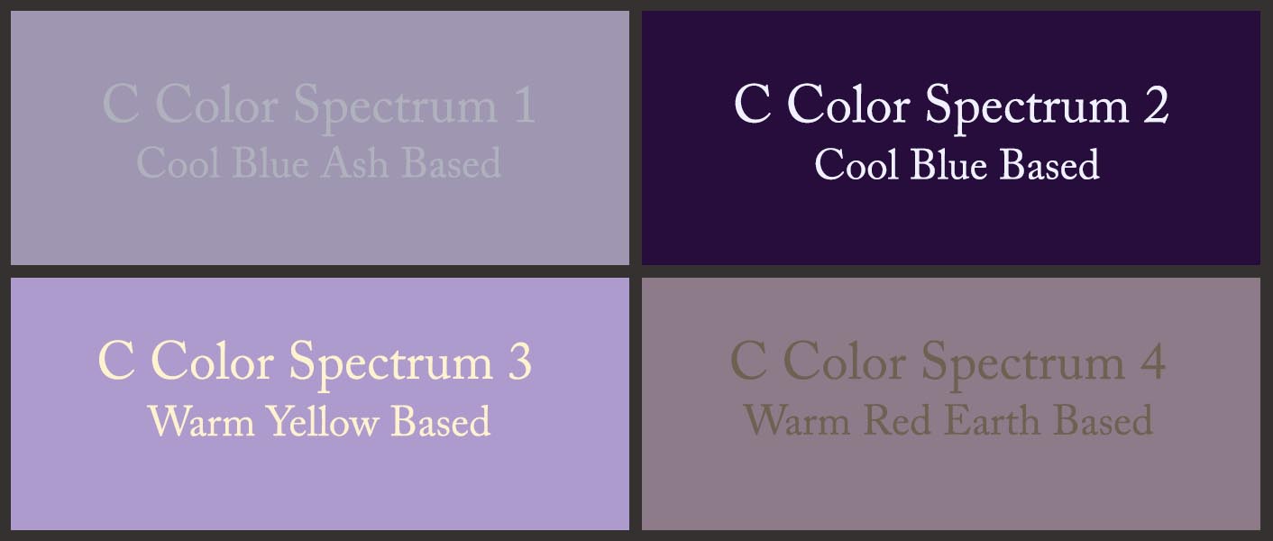
The above color quadrant displays a Cool Blue Ash Based lavender color, a Cool Blue Based purple color, a Warm Yellow Based violet color, and a Warm Red Earth Based light purple color, as examples to further distinguish the four C Color Spectrums. Each C Color Spectrum® contains millions of every color.
If you are a C Color Spectrum 3, the colors that you have a propensity toward will have a predominant Warm Yellow Base. If you choose paint colors that are created with the base of Warm Yellow, the colors will always appeal to you. Essentially, the colors will stand the test of time.
The above is true for the three remaining C Color Spectrums 1, 2, and 4, as well.
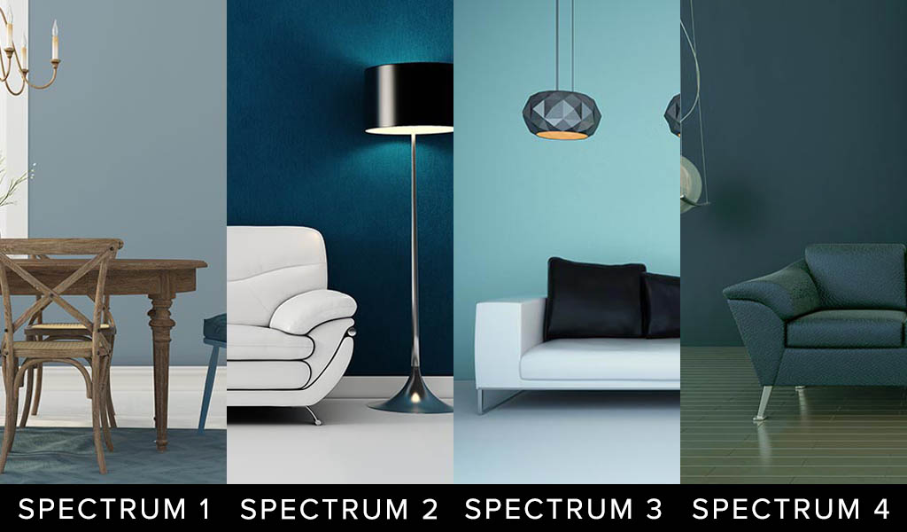
Below are examples of how each of the four C Color Spectrums can introduce the color blue into various areas of a home.
NOTE: THIS COMPOSITE IS BEING UPDATED FOR COLOR ACCURACY
 UTILIZE THE C COLOR APP TO CONFIRM YOUR C COLOR SPECTRUM COLORS
Notice the differences in the four C Color Spectrums:
- C Color Spectrum 1 Gray Blue is Cool Blue Based, Less Saturated, Appears Rubbed with Ash
- C Color Spectrum 2 Blue is Cool Blue Based, More Saturated
- C Color Spectrum 3 Blue is Warm Yellow Based, Moderately Saturated
- C Color Spectrum 4 Blue Teal is Warm Red Based, Less Saturated, Appears Rubbed with Earth
The key to the classification of all colors is the temperature, saturation, and predominant base of one of the primary colors of blue, yellow, or red.
C Color® has an online store to further direct you in your endeavor with colors.
C COLOR COORDINATES
Interchangeable Colors And Patterns In Your C Color Spectrum Developed As Examples For Fashion And Décor
 Shop C Color Spectrum 1
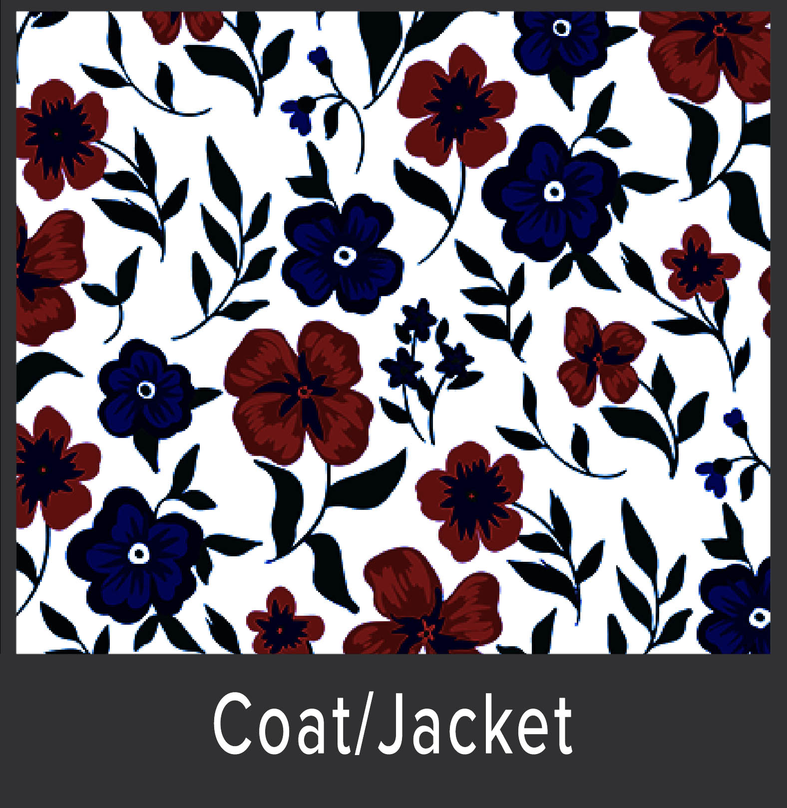 Shop C Color Spectrum 2
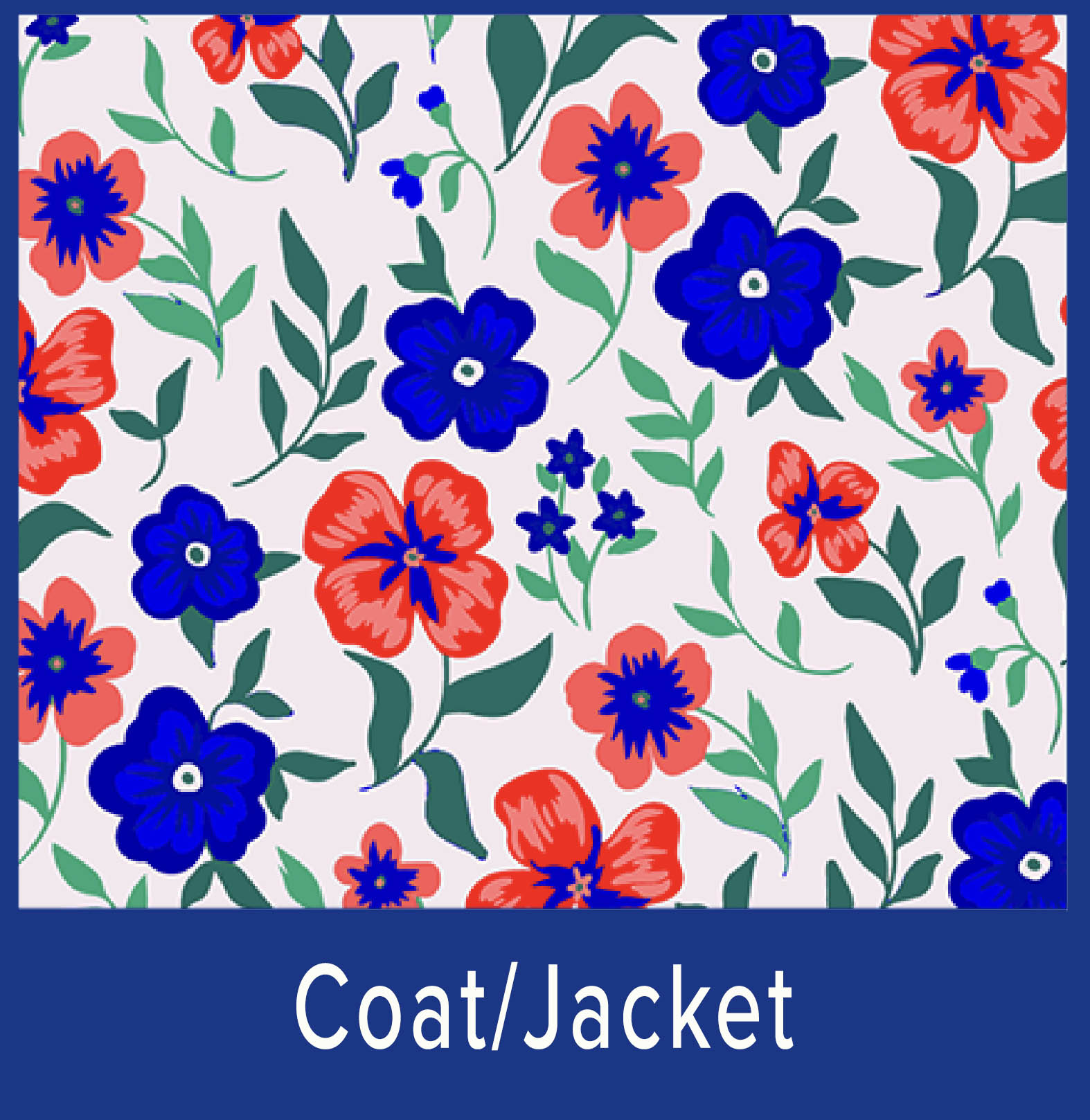 Shop C Color Spectrum 3
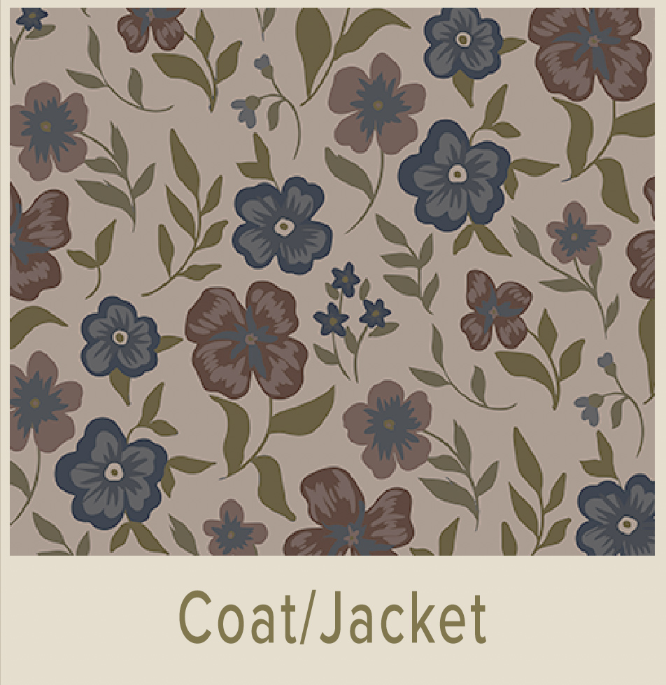 Shop C Color Spectrum 4
Prerequisite: C Color Quiz
Palettes are supplemental to the C Color App
Take The C Color Quiz To Identify Your Innate Color Preferences
To establish your C Color Spectrum® take the five-minute C Color Quiz, which is simple, quick, and effective.
The goal of the C Color Quiz is to select the color quadrant that immediately catches your eye. In doing so, you are following your natural proclivities regarding color inclinations. Thinking about the color options will skew your results.
The accurate aftereffects of the C Color Quiz are solidified by intuitive selections, not thought judgments.
Due to this reason, receiving a Personal C Color Analysis differs from all others on the market.
The efficacy of the C Color Quiz is 99.8%. We do not guarantee hundred percent efficacy, as clients may not consistently follow their latent preferences or intuition throughout the C Color Quiz.
Verify Your Colors Utilizing The C Color App
The objective of C Color is to offer a unique and superior experience with color and to remind you of the colors that you preferred as a child, prior to being influenced by outside sources.
Choosing the perfect paint colors can be effortless, as the C Color® App supports you by confirming your choices. As mentioned above, there are millions of colors within your C Color Spectrum® and millions in the C Color database.
The C Color® App is programmed to your C Color Spectrum®. In other words, the C Color App is your 21st Century Palette and Color Consultant that does the work for you.
When shopping at your local paint store, avail yourself of the C Color App, once you have found swatches of the colors that appeal to you.
- Since all colors contain numerous colors, when employing the C Color App it is imperative to photograph the product of interest at a distance and to color correct the photograph with the Lighting and Filters features.
- The photographed color must match the color of the actual item that the eyes see.
- Once the above two steps are completed, choose a zoomed in section of the pure color, even if blurred to match and the C Color App will reveal whether or not the color is within your C Color Spectrum.
- Execute the built-in capability of the Smartphone to lighten or darken the photograph, if necessary.
- Avoid bright areas and shadowed areas, as those conditions can affect the color match.
The zooming capacity of the C Color Matching Technology has been embellished to allow for greater accuracy. This improvement ensures that the purest color of the article to be matched can be identified more proficiently and opportunely.
The C Color App has been upgraded to include a color matching Instructional Video, C Color Courses, C Color E-Books, and C Color Spectrum Virtual Color Galleries.
C Color Spectrum Virtual Color Galleries within the C Color App were developed as a vantage point for you from which to better understand the colors within your C Color Spectrum.
The C Color App is a comprehensive color palette that identifies the limitless number of colors that are available to you. These colors are all from within your C Color Spectrum. Appropriately, the C Color Spectrum Virtual Color Galleries are supplemental to the C Color App.
Please be sure to visit the C Color Website.
The refreshed C Color Website includes a plethora of engaging content, simple navigability, and instructive visuals representative of each C Color Spectrum.
Below are examples of how each of the four C Color Spectrums can implement neutral colors in various areas of a home.
NOTE: THIS COMPOSITE IS BEING UPDATED FOR COLOR ACCURACY
 UTILIZE THE C COLOR APP TO CONFIRM YOUR C COLOR SPECTRUM COLORS
Notice the differences in the four C Color Spectrums:
- C Color Spectrum 1 Ash White is Cool Blue Based, Less Saturated, Appears Rubbed with Ash
- C Color Spectrum 2 White is Cool Blue Based, More Saturated
- C Color Spectrum 3 Cream is Warm Yellow Based, Moderately Saturated
- C Color Spectrum 4 Tan is Warm Red Based, Less Saturated, Appears Rubbed with Earth
The key to the classification of all colors is the temperature, saturation, and predominant base of one of the primary colors of blue, yellow, or red.
Please Note That C Color Spectrum 2 White Hues Are Stark White With An Ice Blue Cast, Hence Impossible To Display Online
Browse the C Color Website and C Color Blog Posts for a colorful experience and inspiration regarding all things color.
C Color is an Amazon Influencer. The products offered in the C Color Blog Post are certified to be within C Color Spectrum 3.
C COLOR CURATED PRODUCTS
Coordinated And Interchangeable Products In C Color Spectrum 3

If products are unavailable, Amazon will suggest substitute products. The C Color App will verify if these products are within your C Color Spectrum.
As an Amazon Influencer, C Color earns from qualifying purchases.
The Power Of Color In Your Home And Everyday Surroundings
The optimal colors not only enrich your living environment but can enhance your appearance, can enable you to think more clearly, can produce feelings of well-being, can motivate you to act your best, can facilitate in absorbing new concepts more readily and distinctly, and can aid you in healing.
The online C Color® encounter guides you in interpreting color to convey your true self and demonstrates how to administer the C Color App in all aspects of your world.
Color is the defining factor for all areas of life and in all industries.
Be color fearless by utilizing and surrounding yourself with the colors from your C Color Spectrum and Look, Think, Feel, Act, Learn, and Heal your best.
Download the C Color® App and take the C Color Quiz.
C Color® conquers the color conundrum and teaches you to employ color to successfully express yourself with paint colors and all else.
Look and feel prettier or more handsome, experience glowing skin, receive compliments, gain confidence, and garner color confidence.
C Color Gets You There!
Remember: Hair, Eye, and Skin Colors Don’t Matter
“Color is crucial in painting, but it is very hard to talk about. There is almost nothing you can say that holds up as a generalization, become it depends on too many factors: size, modulation, the rest of the field, a certain consistency that color has with forms, and the statement you’re trying to make.” …Roy Lichtenstein, Artist