
What Is Color Psychology?
Color psychology is the study of hues as a determinant of human behavior. Color can influence perceptions that are not obvious, such as the taste of food.
Colors can affect confidence, thoughts, emotions, behavior, and the ability to learn and retain information. Color can be indispensable to your overall health and wellness.
Interestingly enough, the human eye does not have the mechanism to perceive the color yellow. Yellow is seen psychologically, hence the complexity and comprehensiveness of color.
Wearing and surrounding yourself with the superlative colors can improve your attitude, add a glow and flawless aspect to your complexion, and attract people towards you. These choice colors can enable you to look, think, feel, act, learn, and heal your best.
C Color® has an online store to further direct you in your endeavor with colors.
C COLOR COORDINATES
Interchangeable Colors And Patterns In Your C Color Spectrum Developed As Examples For Fashion And Décor
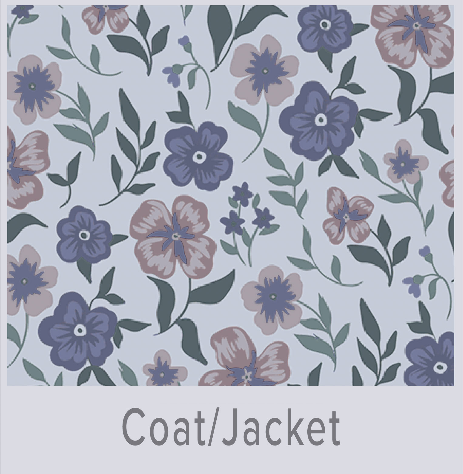 Shop C Color Spectrum 1
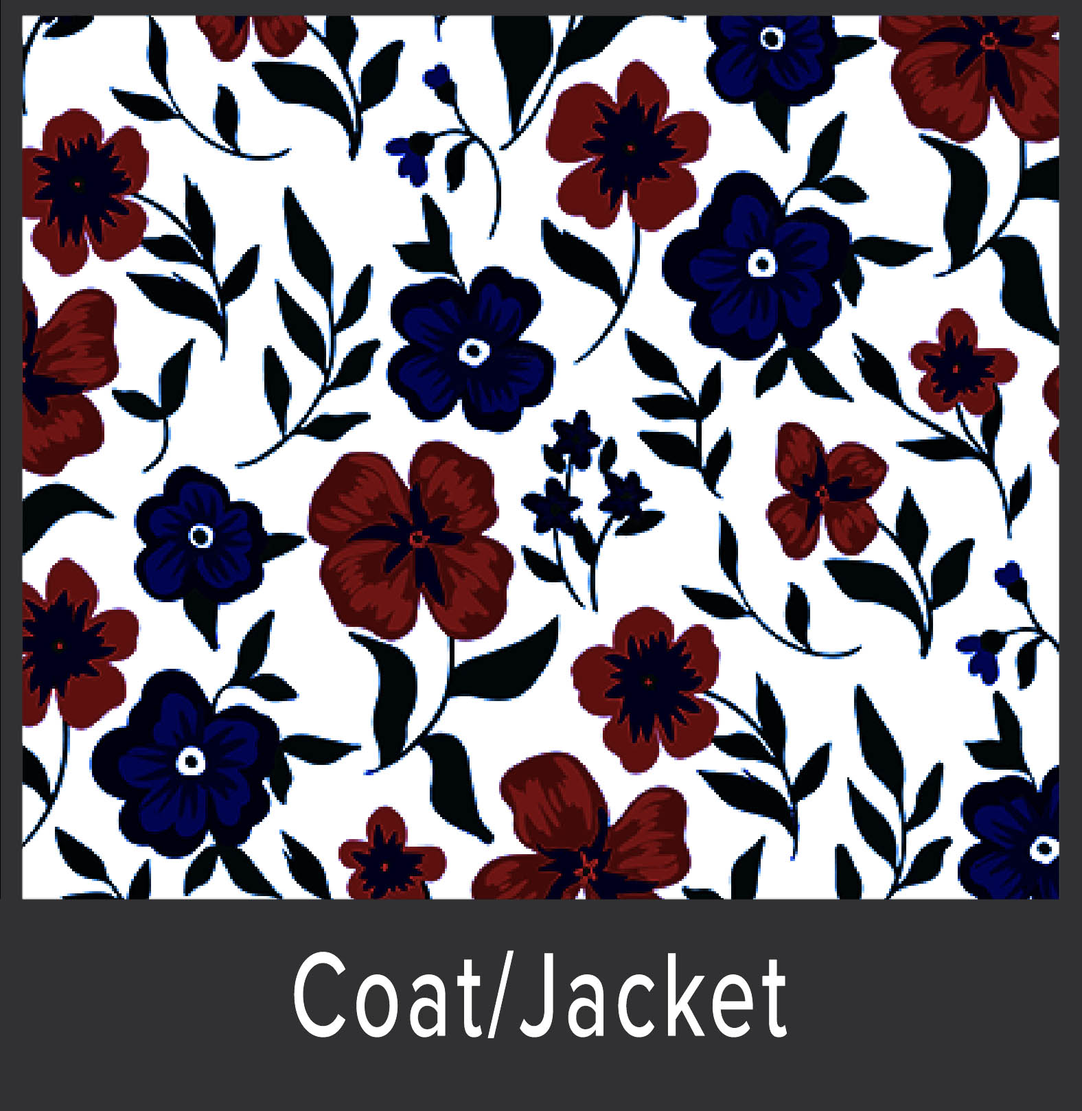 Shop C Color Spectrum 2
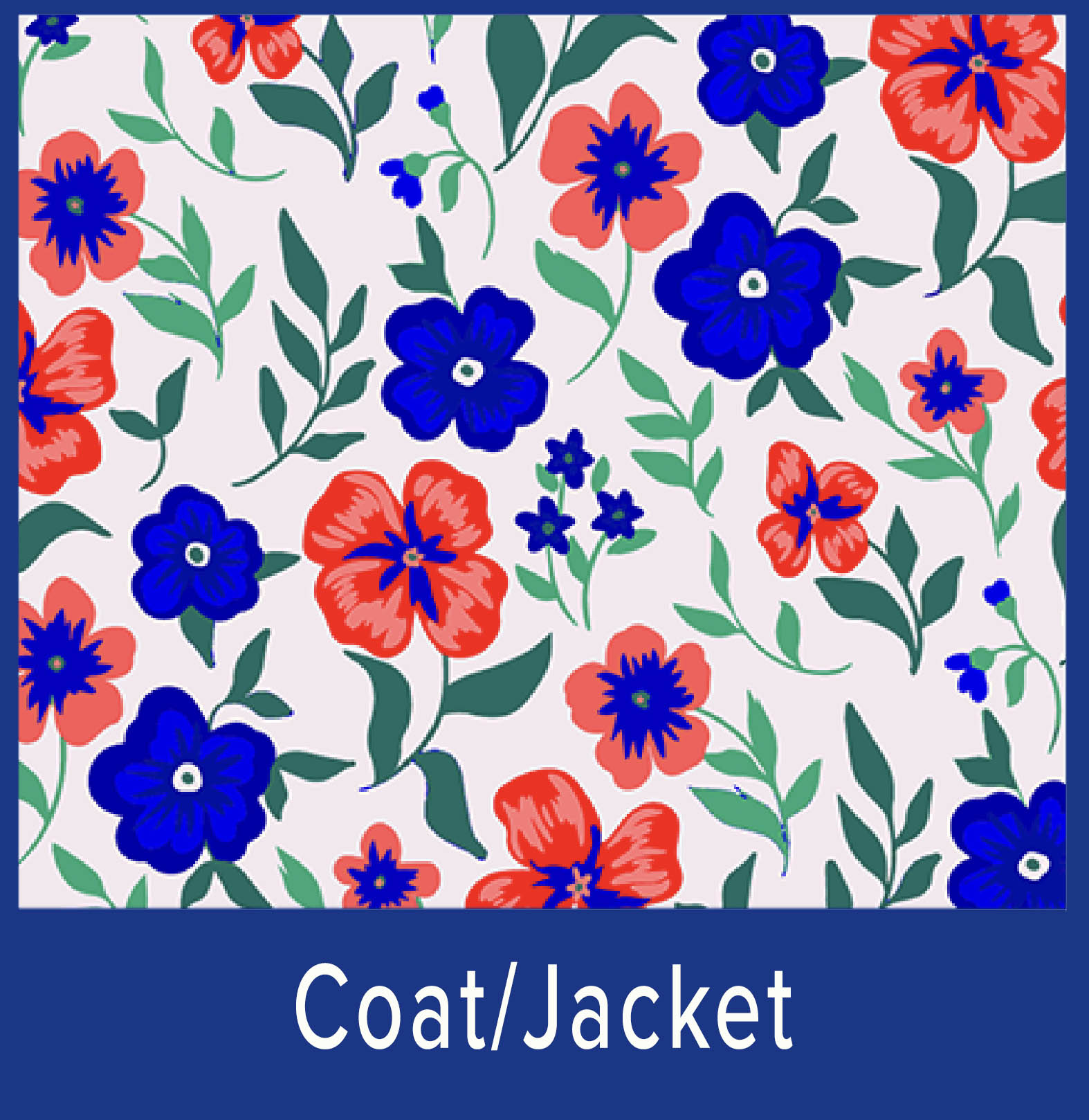 Shop C Color Spectrum 3
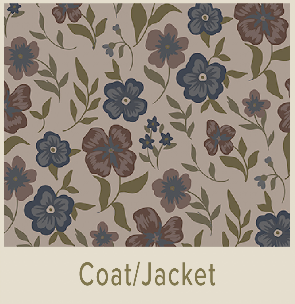 Shop C Color Spectrum 4
Prerequisite: C Color Quiz
Palettes are supplemental to the C Color App
In this Blog Post, you will understand why it is important to establish your DNA recognized, genetic C Color Spectrum®, and optimize your color environment.

Common Misconceptions About Color Psychology
Prior to delving into color psychology as it relates to the C Color® Methodology, it is quintessential to address common misconceptions about the psychology of color.
Misconceptions regarding color psychology will lead you to believe that if you desire to create feelings of calm, peace, and serenity, you should opt to use cool colors, while if you aspire to produce feelings of comfort and energy, you should use warm colors, such as browns, reds, and oranges.
With C Color® all of the colors in your C Color Spectrum® can produce feelings of calm, peace, serenity, comfort, energy, excitement, and an unlimited number of other favorable emotions.
To further complicate the intricate subject of color, people often confuse the temperatures, saturations, and predominant bases of colors. Color analysts, makeup artists, stylists, designers, and most other industry professionals categorize blues, greens, and purples as cool colors and reds, yellows, and oranges as warm colors; nevertheless, all colors can be cool or warm.
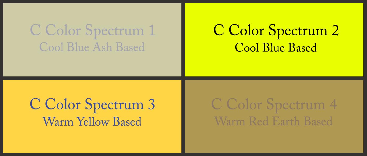
The above color quadrant displays a Cool Blue Ash Based yellow color, a Cool Blue Based yellow color, a Warm Yellow Based yellow color, and a Warm Red Earth Based yellow color, as examples to further distinguish the four C Color Spectrums. Each C Color Spectrum® contains millions of every color.
A C Color Spectrum is a category of a myriad of colors classified by temperature, saturation, and the predominant base of a primary color of either Blue, Yellow, or Red.
The majority of color theories claim that all blues are cool, when in actuality, there are literally millions of the color blue. C Color classifies all of the blues, along with every other color, into four distinct C Color Spectrums.
Two of the four C Color Spectrums contain cool blues, and two of the four C Color Spectrums contain warm blues, even though the predominant base of each of the four C Color Spectrums is unique.
All of the 16.7 million known colors in the world belong in one of the four C Color Spectrums.
To ascertain the hues that can produce feelings of joy, a vibrant appearance, and a sense of contentment, you must first authenticate your C Color Spectrum, which is the result of a latent color gene within your DNA.
C Color Teaches You To Look Inside For Color
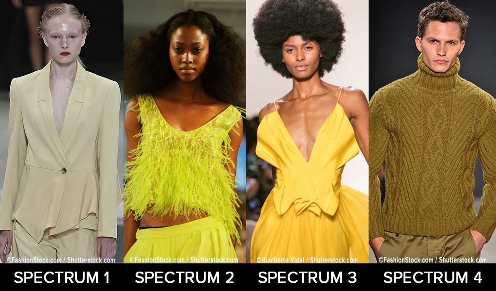
Below are examples of how individuals from each of the four C Color Spectrums can wear yellow and ochre colors.
Please note that clothing and accessory colors are for reference only and do not represent the models’ C Color Spectrums.
NOTE: THIS COMPOSITE IS BEING UPDATED FOR COLOR ACCURACY
 UTILIZE THE C COLOR APP TO CONFIRM YOUR C COLOR SPECTRUM COLORS
Notice the differences in the four C Color Spectrums:
- C Color Spectrum 1 Yellow is Cool Blue Based, Less Saturated, Appears Rubbed with Ash
- C Color Spectrum 2 Yellow is Cool Blue Based, More Saturated
- C Color Spectrum 3 Yellow is Warm Yellow Based, Moderately Saturated
- C Color Spectrum 4 Ochre is Warm Red Based, Less Saturated, Appears Rubbed with Earth
The key to the classification of all colors is the temperature, saturation, and predominant base of one of the primary colors of blue, yellow, or red.
“Does this color look good on me?”
“Is this the right color for my client?”
“Does this color represent my brand?”
These universal questions have been asked by color conscious individuals, color professionals, and the color curious.
Determining the unsurpassed colors is relevant for all aspects of life; thereby, we will focus on presenting how to navigate color in the following fields:
- Fashion
- Makeup Artistry
- Interior Design
- Graphic Design, Marketing, and Branding
Fashion
Wearing the unparalleled colored clothing can send a powerful message to the world, as colors and clothing are an expression and a representation of how you feel about yourself. Consequently, your outward appearance is one of the greatest determinants of your confidence.
To make a good impression, exude confidence, convey a glowing complexion, look your best, and attract people towards you, ensure that you are wearing colors from within your DNA affirmed C Color Spectrum. The color of your clothing is arguably more important than the style of the garments. You may be wearing expensive clothing, but when wearing the merchandise in suboptimal colors, the value of the clothing and your appearance diminish.

Clothing in less than ideal colors draws the life from your skin and wears you, and that means that others notice the color of the garments and not you.
Embrace your C Color Spectrum and further color in fashion to your advantage.
It is unnecessary to clothe yourself in your C Color Spectrum colors from head to toe, as the prime colors are essential from the chest area upward. With that said, once you return to your unquestioned color tendencies, the majority of your wardrobe will be within your C Color Spectrum, as you will be consciously aware of why you are attracted to certain colors.
It is also important to understand the significance of utilizing accessories in the colors within your C Color Spectrum. Subtle splashes of the hues can add radiance to your complexion, introduce another dimension to your appearance, and set you apart from the crowd.
When living in your C Color environment, you will be astonished at the effect your color choices will have on your attitude, mood, and general outlook. As if that is not enough, you will receive compliments from others around you.
Below are examples of how individuals from each of the four C Color Spectrums can wear gray/charcoal, black, gunmetal, and gray colors.
Please note that clothing and accessory colors are for reference only and do not represent the models’ C Color Spectrums.
NOTE: THIS COMPOSITE IS BEING UPDATED FOR COLOR ACCURACY
 UTILIZE THE C COLOR APP TO CONFIRM YOUR C COLOR SPECTRUM COLORS
Notice the differences in the four C Color Spectrums:
- C Color Spectrum 1 Gray and Charcoal are Cool Blue Based, Less Saturated, Appear Rubbed with Ash
- C Color Spectrum 2 Black is Cool Blue Based, More Saturated
- C Color Spectrum 3 Gunmetal is Warm Yellow Based, Moderately Saturated
- C Color Spectrum 4 Gray is Warm Red Based, Less Saturated, Appears Rubbed with Earth
The key to the classification of all colors is the temperature, saturation, and predominant base of one of the primary colors of blue, yellow, or red.
Makeup Artistry
Dr. Arnaud Aubert, Experimental Psychologist and Associate Professor in the Department of Neurosciences, explains, “All the social information is in the center of the face.”
The psychology of color as it relates to cosmetics can guide you in portraying an exuberant complexion as well as self-assurance. Choosing the nonpareil cosmetic colors is paramount to influencing perception, whether you are a makeup artist or one who simply enjoys wearing face paint.
Conventional makeup theory suggests that the colors chosen should correspond with your skin tone, eye color, and hair color. This common misconception places those who wear cosmetics at risk of draining the glow from their complexion, as C Color asserts that external features do not validate your ideal colors. Your DNA is the identifying factor. Appropriately, utilizing cosmetic colors within your C Color Spectrum, can beautify your natural facial features and ensure a flawless, radiant complexion.
The reality is that you can apply any color cosmetic palette of your choosing to your face, as long as the predominant base of those colors corresponds to your C Color Spectrum. The C Color Ideology is nondiscriminatory, leaving no color off limits to you.
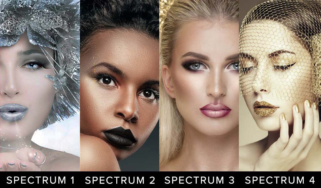
Below are examples of how individuals from each of the four C Color Spectrums can wear cosmetic and accessory colors.
Please note that cosmetic and accessory colors are for reference only and do not represent the models’ C Color Spectrums.
NOTE: THIS COMPOSITE IS BEING UPDATED FOR COLOR ACCURACY
 UTILIZE THE C COLOR APP TO CONFIRM YOUR C COLOR SPECTRUM COLORS
Notice the differences in the four C Color Spectrums:
- C Color Spectrum 1 Silver is Cool Blue Based, Less Saturated, Appears Rubbed with Ash
- C Color Spectrum 2 Charcoal is Cool Blue Based, More Saturated
- C Color Spectrum 3 Gunmetal, Pink, and Burgundy are Warm Yellow Based, Moderately Saturated
- C Color Spectrum 4 Gold is Warm Red Based, Less Saturated, Appears Rubbed with Earth
The key to the classification of all colors is the temperature, saturation, and predominant base of one of the primary colors of blue, yellow, or red.
Interior Design
Similar to clothing, you can employ the colors from within your C Color Spectrum® to positively impact you as it relates to the places that you spend your time, namely, the interiors and exteriors of your home and office. Choosing colors for the interiors and exteriors of your home, declared by your inborn genetic color predilections, can create a calming, uplifting, and motivational ambience. The same is true for your office interiors and exteriors.
Alternatively, living amidst colors not within your C Color Spectrum, can dampen your mood, stifle creativity, and produce an internal sense of restlessness and, at times, chaos. There are many color theories for interior and exterior design, making it significant to note that standard approaches do not target your inherent, DNA championed color partialities.
To reiterate, it is of the utmost importance to ensure that the colors that you are decorating with are indeed within your C Color Spectrum.
By choosing colors within your C Color Spectrum, you can develop environments that are seamlessly strewn together.
When decorating interiors, consider the following approaches:
- Choose two to three colors from within your C Color Spectrum, as the foundation of your décor and expand your colors outward from that foundation
- Unite separate spaces with the same shades of color from within your C Color Spectrum
- Build dimension in a room by painting a focal wall with a color from within your C Color Spectrum
- Select unexpected, although complimentary, color accents for each room from within your C Color Spectrum
- Choose colors from within your C Color Spectrum, depending on which activities take place in the room and the mood you choose to convey
- Light the rooms in line with the C Color Spectrums of the individuals’ living or working in the spaces
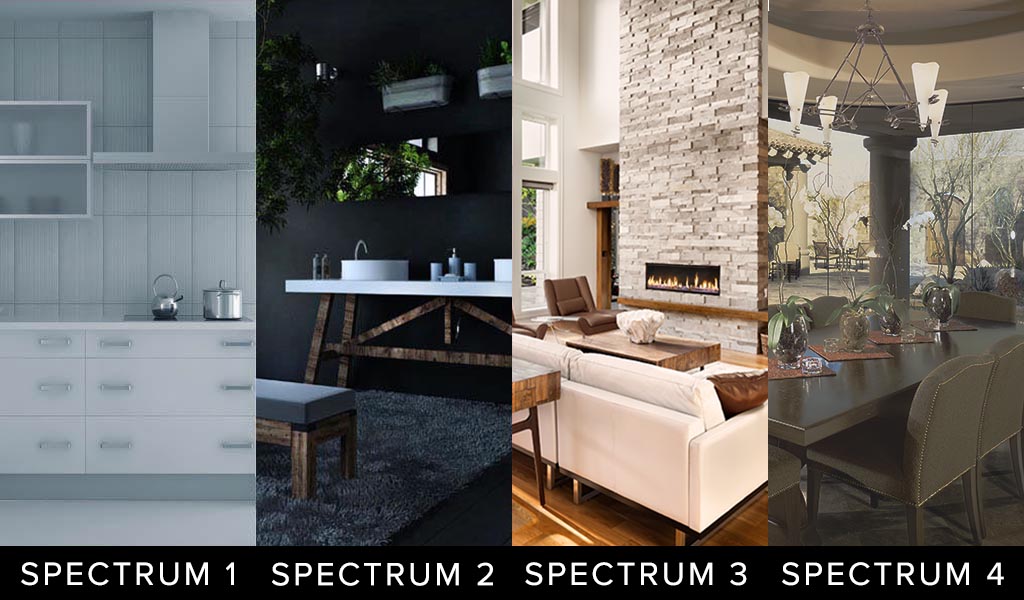
Below are examples of home interior colors for each of the four C Color Spectrums.
 UTILIZE THE C COLOR APP TO CONFIRM YOUR C COLOR SPECTRUM COLORS
Notice the differences in the four C Color Spectrums:
- C Color Spectrum 1 White and Gray are Cool Blue Based, Less Saturated, Appear Rubbed with Ash
- C Color Spectrum 2 Black, White, and Charcoal are Cool Blue Based, More Saturated
- C Color Spectrum 3 Ivory and Gray are Warm Yellow Based, Moderately Saturated
- C Color Spectrum 4 Green and Brown are Warm Red Based, Less Saturated, Appear Rubbed with Earth
The key to the classification of all colors is the temperature, saturation, and predominant base of one of the primary colors of blue, yellow, or red.
Graphic Design, Marketing, And Branding
Persuasive graphic design, marketing and branding are vital in the world today. The image, colors, and messaging of a brand can either positively or negatively influence potential customers. Businesses often flounder in a noisy sea of competition, going unseen and unheard by customers. The client of today is constantly bombarded with imagery and messaging.
The only way to get noticed is to foster a brand image that is visually and psychologically impactful and appealing. Graphic designers and marketers must leverage the fitting colors to command the customer’s attention within seconds.
Conventional color theory branding is rigid. It recommends using red to convey power, blue to create a sense of calm, green to signify growth, and the list goes on; however, color is multidimensional.
With millions of colors in existence, how can one simply guess at the right hue to best resonate with a large audience of people? While a certain shade of blue may be calming to you, it does not necessarily have the same effect on others.
As mentioned previously, all shades of blue reside in each one of the four C Color Spectrums. You may prefer Blue Ash Based Blues, that are Cool, but another person may prefer Yellow Based Blues, that are Warm. The determinant is your intrinsic DNA color proclivities.
When designing a website, app, or any other branded asset, graphic designers and marketers should aim to be inclusive of the colors in each C Color Spectrum. That can be accomplished by the following:
Recommend four hues of the same color from each of the four C Color Spectrums throughout the entire designed asset. The C Color logo and website are examples of this recommendation, as blues from each of the four C Color Spectrums are displayed.
- Know the C Color Spectrums of your targeted audience
- Establish dynamic targeting by displaying colors that correspond to the C Color Spectrums of your customers
- Resort to geographical segmentation for advertising to the four C Color Spectrums
- Create superior and distinctive marketing materials that appeal to all four C Color Spectrums, as collateral from other companies may appeal to one or too few C Color Spectrums
Below are examples of marketing materials for each of the four C Color Spectrums.
 UTILIZE THE C COLOR APP TO CONFIRM YOUR C COLOR SPECTRUM COLORS
Notice the differences in the four C Color Spectrums:
- C Color Spectrum 1 Grays are Cool Blue Based, Less Saturated, Appear Rubbed with Ash
- C Color Spectrum 2 White and Black are Cool Blue Based, More Saturated
- C Color Spectrum 3 Yellow, Pink, and Brown are Warm Yellow Based, Moderately Saturated
- C Color Spectrum 4 Beige and Brown are Warm Red Based, Less Saturated, Appear Rubbed with Earth
The key to the classification of all colors is the temperature, saturation, and predominant base of one of the primary colors of blue, yellow, or red.
Please Note That C Color Spectrum 2 White Hues Are Stark White With An Ice Blue Cast, Hence Impossible To Display Online
C Color is an Amazon Influencer. The products offered in the C Color Blog Post are certified to be within C Color Spectrum 3.
C COLOR CURATED PRODUCTS
Coordinated And Interchangeable Products In C Color Spectrum 3

If products are unavailable, Amazon will suggest substitute products. The C Color App will verify if these products are within your C Color Spectrum.
As an Amazon Influencer, C Color earns from qualifying purchases.
The Importance Of C Color®
C Color is the first and only company to quantify intuitive color preferences. Quantifying intuitive color intelligence is the specialty of our lifestyle technology company.
The C Color Ideology and Methodology will support you in living life in your matchless color environment.
As mentioned, the C Color Ideology is predicated upon a color gene within your DNA. You are born with fundamental propensities toward colors; essentially, you embody the virtue of color intelligence.
The optimal colors can enhance your appearance, can enable you to think more clearly, can produce feelings of well-being, can motivate you to act your best, can facilitate in absorbing new concepts more readily and distinctly, and can aid you in healing.
To determine your C Color Spectrum, take the five-minute C Color Quiz. The objective of the C Color Quiz is to select the color quadrant that immediately catches your eye. In doing so, you are following your immanent color inclinations. Thinking about your color choices will skew your results.
The accurate aftereffect of the C Color Quiz relies upon intuitive choices, not thought choices.
Due to this reason, receiving a Personal C Color Analysis differs from all others on the market.
The efficacy of the C Color Quiz is 99.8%. We do not guarantee hundred percent efficacy, as clients may not consistently follow their innate preferences or intuition throughout the C Color Quiz.
Once your C Color Spectrum is verified, trust the C Color App to substantiate whether or not all goods are within your C Color Spectrum®.
- All colors contain numerous colors; accordingly, it is imperative to photograph the object of interest at a distance and to color correct the photograph with the Lighting and Filters features.
- The photographed color must match the color of the actual item that the eyes see.
- Once the above two steps are completed, choose a zoomed in section of the pure color, even if blurred, to match, and the C Color App will approve or deny the match.
- Take advantage of the built-in capability of the Smartphone to lighten or darken the photograph, if necessary.
- Avoid bright areas and shadowed areas, as those conditions can affect the color match.
The zooming capacity of the C Color Matching Technology has been embellished to allow for greater accuracy. This improvement ensures that the purest color of the article to be matched can be identified more proficiently and opportunely.
The C Color App has been upgraded to include a color matching Instructional Video, C Color Courses, C Color E-Books, and C Color Spectrum Virtual Color Galleries.
C Color Spectrum Virtual Color Galleries within the C Color App were developed as a vantage point for you from which to better understand the colors within your C Color Spectrum.
The C Color App is a comprehensive color palette that identifies the limitless number of colors that are available to you. These colors are all from within your C Color Spectrum. Aptly, the C Color Spectrum Virtual Color Galleries are supplemental to the C Color App.
Please be sure to visit the C Color Website.
The refreshed C Color Website includes a plethora of engaging content, simple navigability, and instructive visuals representative of each C Color Spectrum.
Browse the C Color Website and C Color Blog Posts for a colorful experience and inspiration regarding all things color.
The expert Eye in the C Color® App is accurate, meets your color needs, answers your color questions, assists you in color decision making and saves you thousands of dollars by eliminating misguided color choices.
Unleash the secrets of your DNA and Look, Think, Feel, Act, Learn, and Heal your best, today!
Download The C Color App And Take The C Color Quiz
C Color® conquers the color conundrum and teaches you to implement color successfully in all circumstances of your life!
Look and feel prettier or more handsome; experience glowing skin; receive compliments; gain confidence; and garner color confidence.
C Color Gets You There!
Remember: Hair, Eye, and Skin Colors Don’t Matter