
Pantone has announced that “Viva Magenta” is the 2023 Color of the Year.
“Viva Magenta” is suggested by Pantone to be expressive of optimism, fearlessness, power, joy, and a zeal for life. The color is claimed to be the embodiment of an “appreciation for the natural world”.
Connecting color to an affiliation increases the ability of a person to make a color association, even though the colors of magenta vary, as there are many raspberry type colors.
Last year’s Color of the Year, “Very Peri”, was said to signify the possibilities brought upon by a virtual world.
The Pantone Color Of The Year Narrative
The Color of the Year Program was established in 1999 as an initiative to stimulate conversation surrounding the connection between color and culture.
The selection of the Color of the Year involves global representatives from the color industry, who commune to analyze and forecast color trends. A color is then determined based upon how the group estimates the upcoming year.
Pantone originated as a printing company specializing in color. The Pantone Matching System (PMS) was designed to ensure that color is consistent in terms of how it materializes on paper after being printed. The color swatches have an identifying code that yields the exact colors.
Pantone has since adopted the Fashion, Home + Interiors (FHI) system for textiles, coatings, and pigments.
Printers, designers, other businesses, and consumers are able to be assured that coloring, digital and print, correctly aligns with their brand or individual identity.
Pantone Color Collaborations
Pantone has significant sway in the arena of establishing a yearly color. Industries heavily relying upon color look to Pantone with the intent of discovering trends in fashion, interior design, beauty, graphic design, and more.
Pantone brilliantly collaborates with other companies to market its own Color of the Year products.
In 2012, Pantone collaborated with Sephora and applied the Color of the Year, “Tangerine Tango”, to a new collection of beauty products.
This year, Cariuma has designed a line of “Viva Magenta” sneakers in collaboration with Pantone. Cariuma did the same last year with the 2022 Color of the Year, “Very Peri”.
Pantone, in collaboration with Motorola, has launched a “Viva Magenta” colored phone.
The challenge is that inherent DNA color partialities of individuals are not taken into account when general trends or fashionable colors are identified to be practiced universally and announced to the public at large.
“Viva Magenta”: 2023 Color Of The Year
The Pantone swatch of “Viva Magenta” is a raspberry color that is within the C Color Spectrum 3 grouping.
C Color Spectrums® are categories of millions of colors. Each of the four C Color Spectrums® is classified by the temperature, saturation, and predominant base of one of the primary colors of either blue, yellow, or red; although the bases of the colors may not be particularly noticeable or easily distinguishable by the human eye.
Other colors listed on the Pantone website show the color titled “Viva Magenta” in a variety of C Color Spectrums.
In other words, Pantone reveals many color versions of each Color of the Year.
The actual Pantone swatch of “Viva Magenta” will evoke positive responses from individuals that are within C Color Spectrum 3.
The favorable news, also mentioned in all C Color® Blog Posts relating to Pantone colors, is that in general, all individuals from all C Color Spectrums® can wear renditions of each Pantone Color of the Year, with the exceptions being the 2019, 2024, and 2025 colors.
Below is an example of a C Color Spectrum 3 model wearing both a C Color Spectrum 2 color of Viva Magenta and a C Color Spectrum 3 color of Viva Magenta.
Distinctly, when the model is clad in C Color Spectrum 3 colors, she has a flawless and glowing complexion, as the model, in reality, is within the C Color Spectrum 3 category.
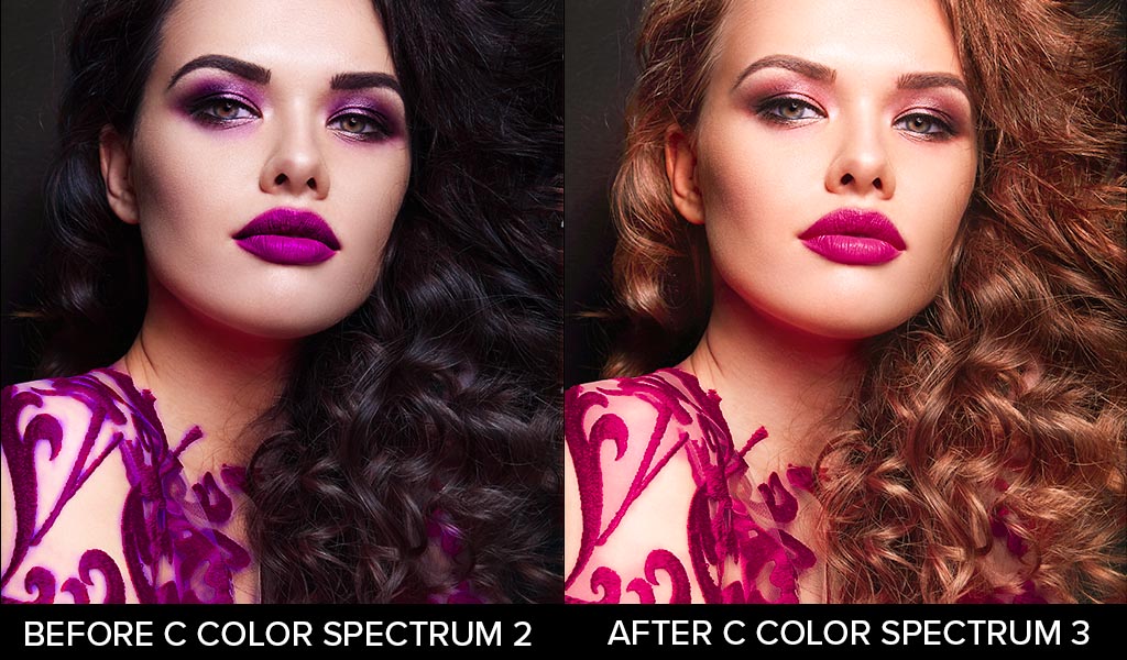 The After Photograph Displays Yellow Based Hair, Makeup, and Dress, Resulting In C Color Spectrum 3
The key to the classification of all colors is the temperature: cool or warm, saturation: less, more, or moderate, and predominant base of a primary color: blue, yellow, or red.
As per the previous Pantone colors, in 2017 “Greenery” and in 2018 “Ultra Violet” were within the C Color Spectrum 3 category; although, individuals from all C Color Spectrums wear variations of green and violet or lavender.
The key is that the colors will have the properties of each specific C Color Spectrum.
The Pantone colors, in 2019 “Living Coral” and in 2024 “Peach Fuzz,” were within the C Color Spectrum 3 category, although variations of ”Living Coral” and “Peach Fuzz” could only be utilized by C Color Spectrum 4 individuals.
Peach, Coral, and Orange colors do not appeal to individuals within the C Color Spectrum 1 category, which is Cool, Blue Ash Based, and Less Saturated, and individuals within the C Color Spectrum 2 category, which is Cool, Blue Based, and More Saturated.
The 2020 Pantone Color of the Year was “Classic Blue,” and that particular hue was within the C Color Spectrum 4 category, although individuals from all C Color Spectrums wear variations of light blue.
In 2021, Pantone chose two Colors of the Year, and they were ”Ultimate Gray”, which was within the C Color Spectrum 1 category, and “Illuminating Yellow”, which was within the C Color Spectrum 3 category, although individuals from all C Color Spectrums wear variations of gray and yellow.
The 2022 color “Very Peri” is within the C Color Spectrum 3 category, although individuals from all C Color Spectrums wear variations of lavender or violet.
The 2025 Pantone swatch of “Mocha Mousse” is a tan color that has a predominant Warm, Red Earth Base, and is Less Saturated, and those color properties are within the C Color Spectrum 4 category. With that said, variations of the tan colors can only be utilized by C Color Spectrum 3 individuals.
Given that “Mocha Mousse” is an original Pantone color developed for the “Color of the Year” occasion, it is impossible to find the precise color. The Pantone website does display various iterations of “Mocha Mousse”.
If you have discovered through the C Color Quiz that you are within the C Color Spectrum 3 category and the actual swatch of “Mocha Mousse” is not a suitable color for you, do not worry. As mentioned above, there are millions of tan colors that are appropriate for C Color Spectrum 3 individuals, with the distinguishing factor of each tan hue being the temperature, saturation, and predominant base of a primary color.
Lastly, tan colors do not appeal to individuals within the C Color Spectrum 1 category, which is Cool, Blue Ash Based, and Less Saturated, and individuals within the C Color Spectrum 2 category, which is Cool, Blue Based, and More Saturated.
The above are perfect examples of the fact that color trends may or may not suit your inherent DNA color preferences. Fortuitously, there are millions of each color, and all C Color Spectrums contain endless variations of the Pantone colors.
To reiterate, if any of the Pantone Colors of the year are not favorable colors for you, the limitless color options in your C Color Spectrum® can be elected.
Obviously, your praiseworthy colors are of note, as the benefits gained from this awareness are innumerable. Satisfaction with your daily color judgments is just one substantial gain. Alluring semblance, lofty bearing, coveted confidence, and resplendent domain are a few additional betterments.
C Color® is the first and only company to quantify intuitive color propensities. The C Color Quiz, that is a part of the C Color App, is a color analysis algorithm which classifies users into one of the four C Color Spectrums®. The C Color Quiz can be found on the C Color App.
C Color Teaches You To Look Inside For Color
To make color a personal endeavor, C Color takes into account the implicit color inclinations of clients and grants them the opportunity to discover their own optimal colors with the C Color Quiz and color matching automation protocol.
Discerning Your Laudatory Colors
Discerning the colors that are commendable for you is a relatively uncomplicated process. The unfortunate circumstance is that many people struggle with confusion pertaining to color.
The color conflict can result in people purchasing what they deem to be “safe” colors, when in truth, all colors are SAFE if they are chosen from within your C Color Spectrum®.
C Color® is a lifestyle technology company that challenges established color theory beliefs. The evolution of color in relation to the human species has been limited, if not substantially nonexistent; yet, color is incontrovertibly consequential and far reaching.
Quantifying individuals’ proclivities for color intelligence is the specialty of C Color, and that Ideology and the C Color Methodology will support you in living life in your unrivaled color environment.
The C Color Ideology is predicated upon a color gene within your DNA. You are born with instinctive predilections toward colors; accordingly, you embody the virtue of color intelligence.

The young experience no conflict with color, as native color tendencies are followed without hesitation.
People, for the most part, love hues but do not believe that they can wear and surround themselves with color. Conversely, individuals tend to assign inaccurate beliefs to color and associate emotions, positive and negative, with hues, despite the actuality that those beliefs and emotions are often unfounded.
There are 16.7 million colors in the world, and C Color® presents an innovative Methodology to navigate color and guides you in choosing the incomparable colors for fashion, accessories, hair, cosmetics, interiors and exteriors of homes, offices, automobiles, and everything else within your world.
C Color® has an online store to further direct you in your endeavor with colors.
C COLOR COORDINATES
Interchangeable Colors And Patterns In Your C Color Spectrum Developed As Examples For Fashion And Décor
 Shop C Color Spectrum 1
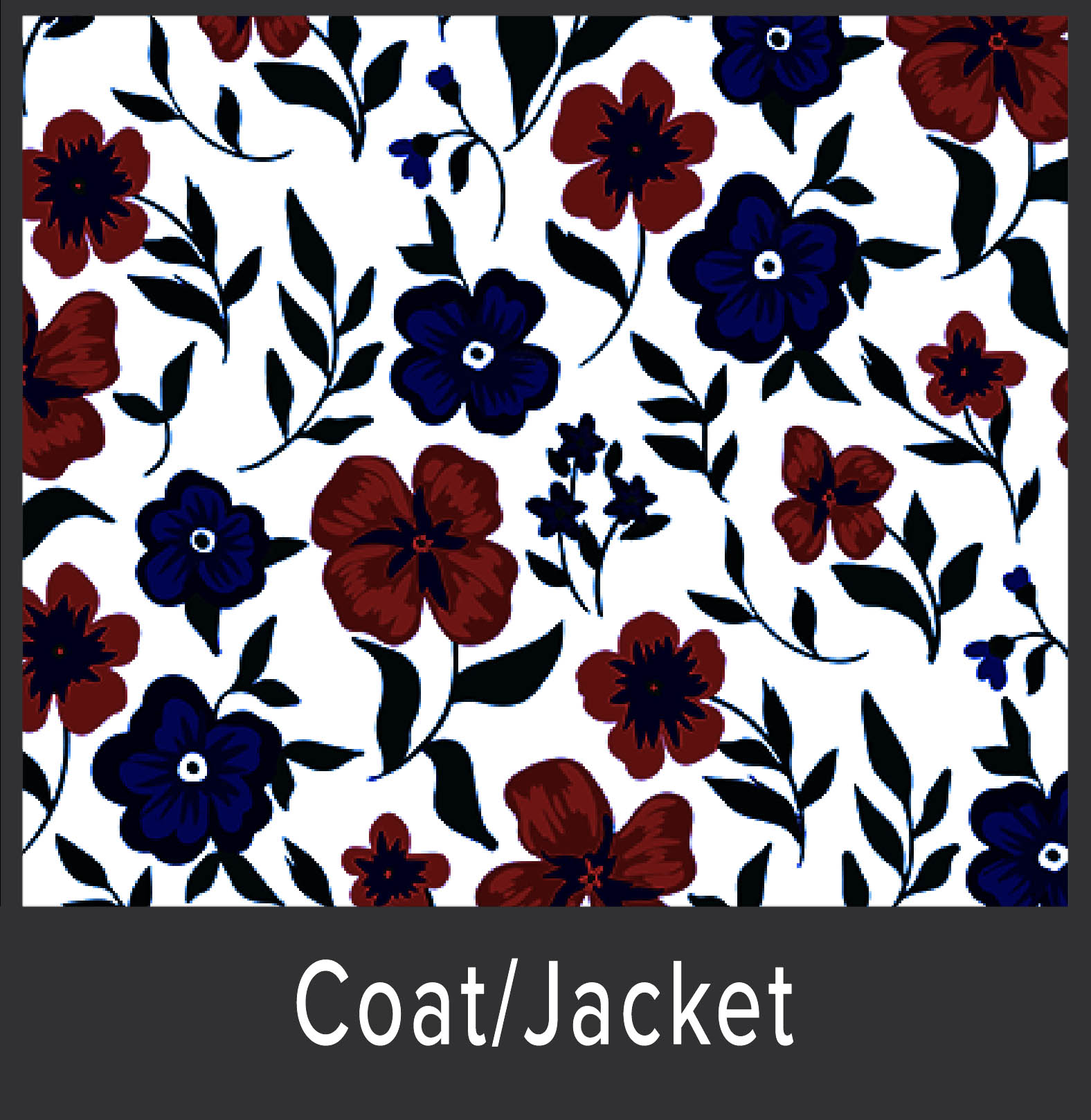 Shop C Color Spectrum 2
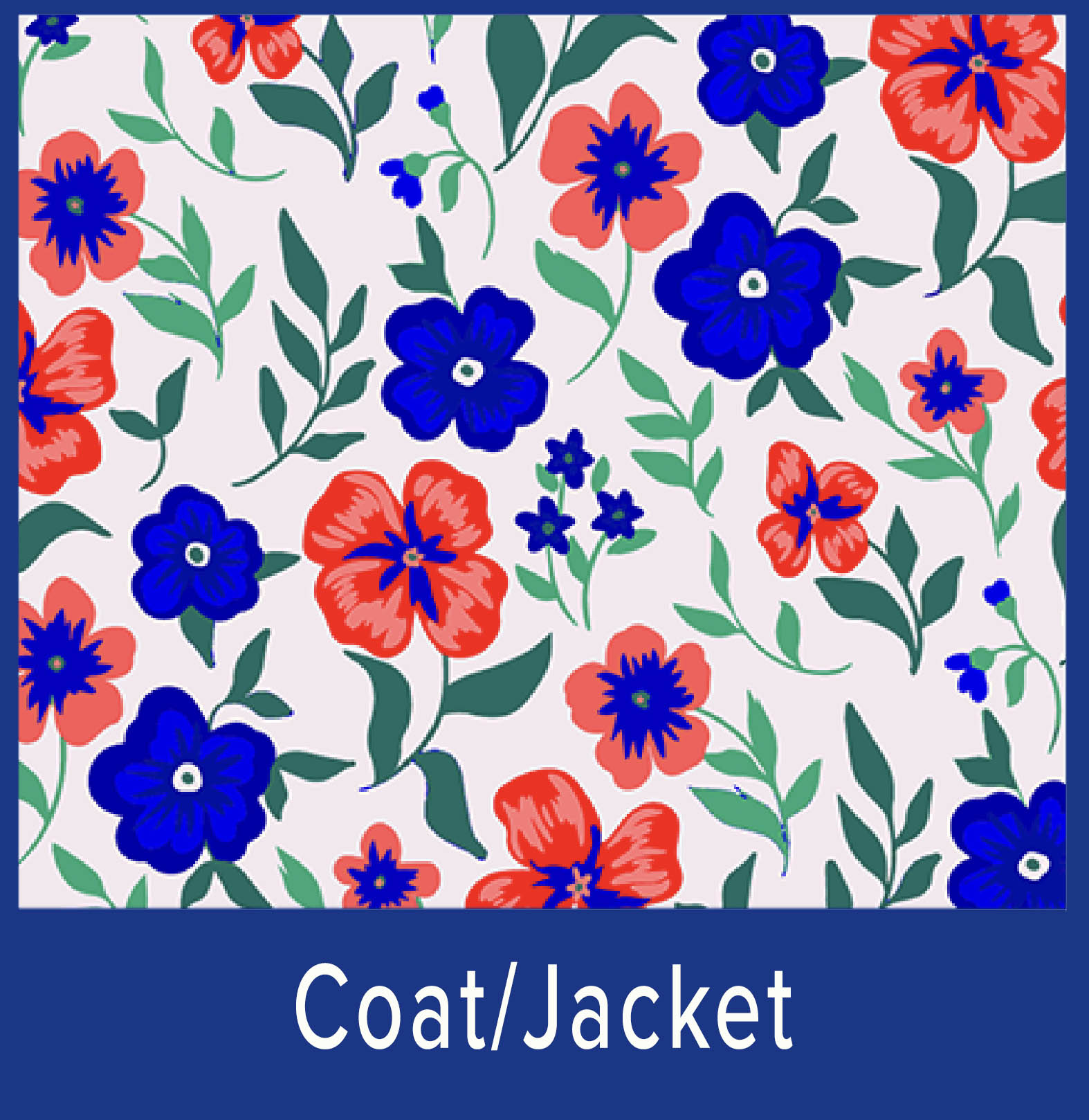 Shop C Color Spectrum 3
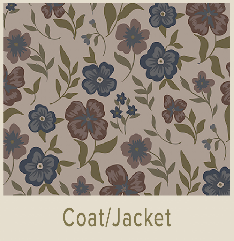 Shop C Color Spectrum 4
Prerequisite: C Color Quiz
Palettes are supplemental to the C Color App
Whereas C Color espouses that there is a color gene within your DNA, the external features of hair colors, eye colors, and complexion colors are not relevant in determining your C Color Spectrum® or your superlative colors.
C Color® does NOT employ the ineffective correlation of utilizing hair, eye, and complexion colors to establish the hues that you should surround yourself with and wear, nor is a color draping app required.
C Color deciphers the color code and provides a cogent, compelling, and linear color tenet.

The C Color Quiz verifies your C Color Spectrum® and has an efficacy rate of an astounding 99.8%. We do not guarantee hundred percent efficacy, as clients may not consistently follow their innate preferences or intuition throughout the C Color Quiz.
There is no other color analysis doctrine on the market that can avow that aftereffect.
Quick, simple, and interpretative, the C Color Quiz, consisting of nine color panels, distinguishes your genetically irrefutable C Color Spectrum®.
The objective of the C Color Quiz is to select the color quadrant that immediately catches your eye. In doing so, you are following your immanent color predispositions. Thinking about the color options will skew the aftereffect.
The accurate outcomes of the C Color Quiz are based upon intuitive judgments, not thought choices.
Due to this reason, receiving a Personal C Color Analysis differs from all others on the market.
Authenticate your C Color Spectrum® and take advantage of the C Color® App. The best color analysis app is the C Color App.
Choosing the proper colors has been simplified for you with the C Color App, as your mobile phone will be programmed to your C Color Spectrum. Millions of colors comprise each C Color Spectrum, and millions of colors are differentiated within the C Color database.
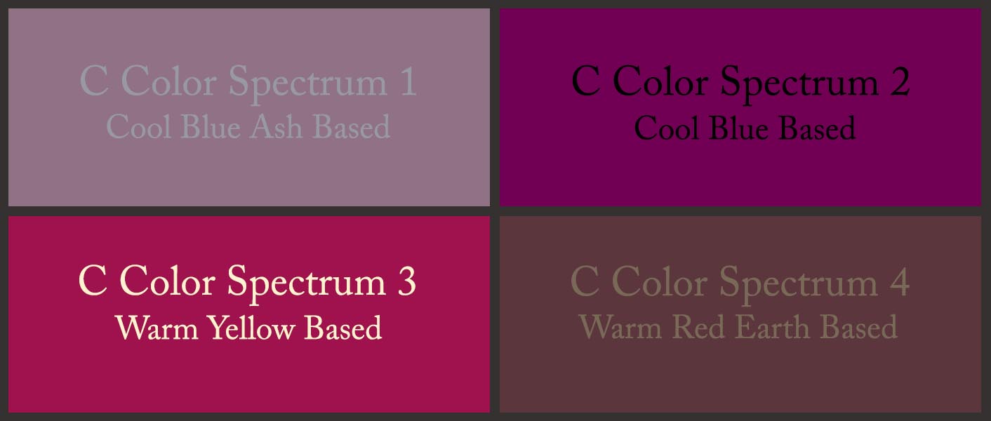
The above color quadrant displays a Cool Blue Ash Based pink color, a Cool Blue Based pink color, a Warm Yellow Based raspberry color, and a Warm Red Earth Based wine color, as examples to further distinguish the four C Color Spectrums. Each C Color Spectrum® contains millions of every color.
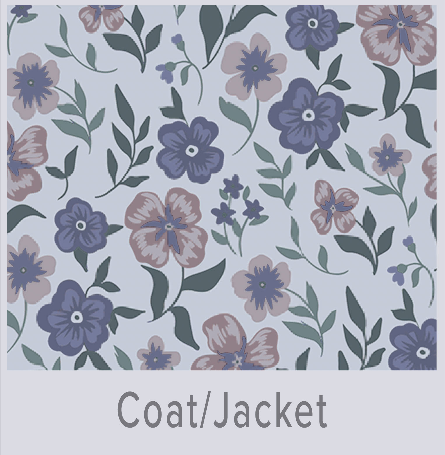
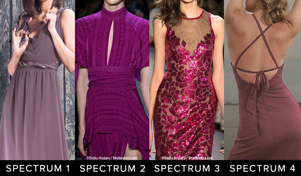
Below is the first example of how individuals from each of the four C Color Spectrums can wear variants of the color of the year, “Viva Magenta”.
Please note that clothing and accessory colors are for reference only and do not represent the models’ C Color Spectrums.
 UTILIZE THE C COLOR APP TO CONFIRM YOUR C COLOR SPECTRUM COLORS
Notice the differences in the four C Color Spectrums:
- C Color Spectrum 1 Viva Magenta is Cool Blue Based, Less Saturated, Appears Rubbed with Ash
- C Color Spectrum 2 Viva Magenta is Cool Blue Based, More Saturated
- C Color Spectrum 3 Viva Magenta is Warm Yellow Based, Moderately Saturated
- C Color Spectrum 4 Viva Magenta is Warm Red Based, Less Saturated, Appears Rubbed with Earth
The key to the classification of all colors is the temperature, saturation, and predominant base of one of the primary colors of blue, yellow, or red.
Invest in C Color; gain access to the colors from within your C Color Spectrum®; become your own personal color consultant; and achieve color independence.
“Viva Magenta” Pantone Swatch Is Categorized Within C Color Spectrum® 3
As stated prior in the Blog Post, the “Viva Magenta” Pantone swatch is a color from within C Color Spectrum 3. The raspberry color is Warm predominately Yellow Based and Moderately Saturated.
Pursuant to taking the C Color Quiz, you may be wondering if “Viva Magenta” is an exemplary color for you.
Do not be concerned if you have discovered via the C Color Quiz that you are not within the C Color Spectrum 3 category and “Viva Magenta” is not a suitable color for you. There are millions of red raspberry colors that are admirable for all of the C Color Spectrums. The discernible factors of each red raspberry hue are the temperature, saturation and predominant base of a primary color.
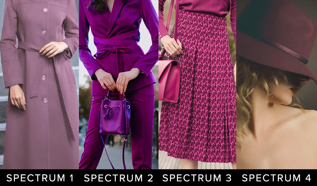
Below is the second example of how individuals from each of the four C Color Spectrums can wear “Viva Magenta” colors.
Please note that clothing and accessory colors are for reference only and do not represent the models’ C Color Spectrums.
 UTILIZE THE C COLOR APP TO CONFIRM YOUR C COLOR SPECTRUM COLORS
Notice the differences in the four C Color Spectrums:
- C Color Spectrum 1 Viva Magenta is Cool Blue Based, Less Saturated, Appears Rubbed with Ash
- C Color Spectrum 2 Viva Magenta is Cool Blue Based, More Saturated
- C Color Spectrum 3 Viva Magenta is Warm Yellow Based, Moderately Saturated
- C Color Spectrum 4 Viva Magenta is Warm Red Based, Less Saturated, Appears Rubbed with Earth
The key to the classification of all colors is the temperature, saturation, and predominant base of one of the primary colors of blue, yellow, or red.
People often confuse the temperatures, saturations, and predominant bases of colors. Color analysts, makeup artists, stylists, designers, and most other industry professionals categorize blues, greens, and purples as cool colors and reds, yellows, and oranges as warm colors; nevertheless, all colors can be cool or warm.
Colors similar to “Viva Magenta” that are suitable for C Color Spectrum 1 individuals are predominantly Cool Blue Ash Based Reds. The colors will have less saturation and appear rubbed with ash.
Colors similar to “Viva Magenta” that are suitable for C Color Spectrum 2 individuals are predominantly Cool Blue Based Reds. The colors will have more saturation.
Colors similar to “Viva Magenta” that are suitable for C Color Spectrum 4 individuals are predominantly Warm Red Earth Based Reds. The colors will have less saturation and appear rubbed with earth.
Suggestions For Including “Viva Magenta” Into Your World
Below are examples of accessories and clothing in variations of the “Viva Magenta” color.
Please note that accessory and clothing colors are for reference only and do not represent the models’ C Color Spectrums.
 UTILIZE THE C COLOR APP TO CONFIRM YOUR C COLOR SPECTRUM COLORS
Notice the differences in the four C Color Spectrums:
- C Color Spectrum 1 Viva Magenta is Cool Blue Based, Less Saturated, Appears Rubbed with Ash
- C Color Spectrum 2 Viva Magenta is Cool Blue Based, More Saturated
- C Color Spectrum 3 Viva Magenta is Warm Yellow Based, Moderately Saturated
- C Color Spectrum 4 Viva Magenta is Warm Red Based, Less Saturated, Appears Rubbed with Earth
The key to the classification of all colors is the temperature, saturation, and predominant base of one of the primary colors of blue, yellow, or red.
C Color is an Amazon Influencer. The products offered in the C Color Blog Post are certified to be within C Color Spectrum 3.
C COLOR CURATED PRODUCTS
Coordinated And Interchangeable Products In C Color Spectrum 3

If products are unavailable, Amazon will suggest substitute products. The C Color App will verify if these products are within your C Color Spectrum.
As an Amazon Influencer, C Color earns from qualifying purchases.
The C Color® App Explained
Designed and developed utilizing artificial intelligence, the C Color® App, as your handheld color stylist, approves or denies the color matches for you. Assimilate the C Color® App into your daily life by utilizing the color matching automation for all of your color intentions.
Color consultant training and color consultant courses are needless with the C Color App.
It takes patience and finesse to learn to administer the C Color App, and color in general is complicated. Succeeding that situation, you will have a 21st Century Palette and Personal Color Consultant at your fingertips.
The laudable colors augment your outward appearance and your life. You will unequivocally experience the magic that color creates.
- Considering that all colors contain numerous colors, it is imperative to photograph the object of interest at a distance and to color correct the photograph with the Lighting and Filters features.
- The photographed color must match the color of the actual item that the eyes see.
- Pursuant to the completion of the above two steps, choose a zoomed in section of the pure color, even if blurred, to match, and the C Color® App Expert Eye will reveal whether or not the color is commendable for you.
- The zooming capacity of the C Color App Matching Technology has been embellished to allow for greater accuracy. This improvement ensures that the purest color of the article to be matched can be identified more proficiently and opportunely.
- Apply the built-in capability of the Smartphone to lighten or darken the photograph, if necessary.
- Avoid bright areas and shadowed areas, as those conditions can affect the color match.
The Filters offered on the C Color App assist with the Lighting adjustments of the photograph that you have chosen to match.
The Lighting Slider offered on the C Color App assists with the Temperature of the photograph that you have chosen to match.
The Lighting and Filters components of the C Color App were included to support you with perfecting the colors of the photographs; nevertheless, as with the similar lighting and filters features within the smart phones, artful nuance is required. Ensure that the garment is photographed at a distance and in adequate light, if convenient, as bright areas and shadows can alter the colors.
Please also be cognizant that assessing if you are instantly and intuitively attracted to the colors of the fitting is paramount. Attempt to keep your brain out of the equation, as your intuitive self has the correct answers.
The C Color® App endows you with the ability to elect notable colors declared upon the temperature, saturation, and predominant base of one of the primary colors of either blue, yellow, or red.
All of the above is accomplished on your mobile device. Ultimately, you have a color stylist at your disposal all day, every day.
The C Color App renders color independence, along with a myriad of other benefits.
We intuitively know our praiseworthy colors, as all individuals embody color intelligence. You and the C Color App ideally work in tandem. If colors did not match your C Color Spectrum that you presumed would match, as similar colors had matched, then the bright and shadowed areas of the photograph need to be avoided. It does take training to capture a photo in appropriate lighting and to eliminate the bright and shadowed areas. Once mastered, you can become a color consultant for yourself.
In regard to patterns, direct the camera toward the color that is the most prominent within the pattern and that sits nearest the face. The dominant color within any patterned apparel is the color that must be identified as a color within your C Color Spectrum.
The C Color App has been upgraded to include a color matching Instructional Video, C Color Courses, C Color E-Books, and C Color Spectrum Virtual Color Galleries.
C Color Spectrum Virtual Color Galleries within the C Color App were developed as a vantage point for you from which to better understand the colors within your C Color Spectrum.
The C Color App is a comprehensive color palette that identifies the limitless number of colors that are available to you. These colors are all from within your C Color Spectrum. Appropriately, the C Color Spectrum Virtual Color Galleries are supplemental to the C Color App.
Please be sure to visit the C Color Website.
The refreshed C Color Website includes a plethora of engaging content, simple navigability, and instructive visuals representative of each C Color Spectrum.
Browse the C Color Website and C Color Blog Posts for a colorful experience and inspiration regarding all things color.
Change Your Life With C Color®
The C Color App, as the 21st Century Palette and Color Consultant, is accurate, meets your color needs, answers your color questions, assists you in color decision making, and saves you thousands of dollars by eliminating misguided color choices.
Wearing and utilizing colors within your C Color Spectrum® can enhance your appearance, can enable you to think more clearly, can produce feelings of well-being, can motivate you to act your best, can assist you in absorbing new concepts more readily and distinctly, and can aid you in healing.
Make Color Personal; Look, Think, Feel, Act, Learn, and Heal with C Color®
C Color® conquers the color conundrum and teaches you to implement color to successfully present yourself to society!
Download The C Color App And Take The C Color Quiz
Look and feel prettier or more handsome; achieve glowing skin; receive compliments; gain confidence; and garner color confidence.
C Color Gets You There!
Remember: Hair, Eye, and Skin Colors Don’t Matter